This exhibit is rooted in the relationship between film and architecture, and it includes a series of works from 2001 to 2011 that examine the construction of the gaze at the threshold that separates public space from the private sphere, a characteristic of modern architecture.
Films will be shown as Zentrum (2004-2010), where the artist explores the socialist architecture "Bruehlzentrum" in Leipzig, built in the 60's; 10104 Angelo View Drive (2004), Poverty Housing Americus Georgis (2008) and Pavilion (2009 ), a film created for the Venice Biennale in 2009 and based in the pavilion designed by Josef Hoffman in 1934. The exhibition also will include a series of photographs as Paramount Studio (2002) Housing and Poverty (2006) among others.
Margreiter been investigated repeatedly in her work, the relationship between architecture and film, defying the conventions of representation. It is also interested in the role that architecture plays in shaping everyday identity, in addition to the role that audiences play in the creation of architectural context. In the process, the artist has always used different means, such as film, video, text, drawings or photographs.
Today, Dorit Margreiter lives and works in Vienna where she teaches video and installation in the Akademie der Bildenden Künste. Among his solo exhibitions, notably those produced in the MAK - Center for Art and Architecture in Los Angeles, at the Galerie für zeitgenössische Kunst by Leipzig and at the Museum Moderner Kunst Stiftung Ludwig in Vienna.
Dorit Margreiter: Description
Meeting with Dorit Margreiter. January 12, 2011
For Dorit Margreiter questions pertaining to the preservation or, conversely, the destruction of late Modernist architecture provide the occasion for probing larger issues shaping our contemporary socio-cultural context. Comprised of a carefully calibrated selection of works made over the past seven years, Description, her first major survey show, highlights an abiding preoccupation. Four installations involving projected film are accompanied by ancillary related works. A nexus of interrelated pieces titled zentrum, (2004 and ongoing), is located like a hinge at the juncture of the exhibition’s two principal axes. Tellingly, zentrum has also provided the point of departure for the quartet of new works dispersed throughout the galleries. Monumental metal mobiles, these sculptures reference text-based works installed in adjacent spaces in that they, too, are comprised of letters from an alphabet created by the artist; when they are considered as moving images, however, their closest affinities are with her film projections.
The genesis for zentrum was a monumental neon sign used to identify a housing complex constructed in 1963 in Leipzig named “Brühlzentrum”. By 2004, when Margreiter travelled there as the recipient of a Blinky Palermo fellowship, it was slated for demolition. Tasked with the creation of a new work for exhibition in the city’s contemporary art space, she was immediately drawn to this social complex comprised of public housing, a theatre, restaurant and kindergarten, for the way it formed a kind of small town in the centre of town: though she found it mediocre in architectural terms, she was impressed by its articulation of its social function and, not least, by its logotype. As an occasional graphic designer, Margreiter had long been aware not only of Leipzig’s vaunted reputation for neon lettering but of its widely esteemed traditions of typographic design and type setting (1). Titled zentrum, the protean project that resulted from further in situ research, is comprised of a 16 mm film that reveals the sign illuminated one last time; a short video that documents the ingenious way that the artist and her assistants effected this feat; cardboard sculptural models based on the letters’ forms in a one to one scale; and a trio of posters. One poster outlines the singular qualities of the digital Panasonic camera, that has a function mimicking film recording, on which she shot the illuminated logotype; another depicts the complete alphabet of the typeface that she devised based on the resurrected sign; and the third deploys that font to spell out the word “analog”.
Analogy, meaning an equivalency or relational likeness, binds the diverse and ongoing manifestations of this multipartite project. Rather than repairing the damaged neon tubing used in the sign, she had wrapped the letters in luminous tape then filmed the signage with the aid of hand-held lamps, that is, she restored it with the means used for its recording. Shot digitally, this footage was then transferred to 16 mm film for projection in the gallery. Through such subtle sleights of hand, physical space is transposed back and forth between digital and analogue spacialities; in turn the abbreviated logotype generated a versatile language for visual and verbal representation. Shortly after its debut on the posters, the alphabet was deployed in a web-site project commissioned by Dia Art Foundation (2). Streamed on-line, the typeface provides the visual form for the dissemination of the institution’s press releases. Given that the text appears at high speed in the guise of fragmentary digital images this on-line piece recalls, somewhat paradoxically, early modernist animated films by Oskar Fischinger and others. In a related reprise of old and new technologies, Margreiter’s proto-cinematic mobiles invert normative relations between printed and time-based media, for their gently drifting letters, cut from sheet aluminium, evoke not today’s electronic media but the origins of standardized type in hot metal printing. By means of such deft transpositions between digital, filmic and material forms of representation Margreiter constructs a discursive space through which she probes the socio-cultural ramifications of what OMA terms our age’s endemic “cronocaos.”
Not incidentally, her typeface recalls prototypes devised by Bauhaus associates Josef Albers and Herbert Bayer. Conceived in 1926, Albers’ Kombinations Schrift was created, like Bayer’s Universal alphabet, from a highly restricted repertoire of simple geometric shapes. Modular and standardized, Albers’ headline font was devised for broad application in an industrial era whose hallmarks were speed, economy, and convenience. At a time when, according to its prophetic inventor, the magazine was replacing the book as the principal tool for communication, graphic signage of all kinds would play an increasingly crucial role in contemporary life. Suspended delicately from cross beams, the elements that comprise Margreiter’s letters are scaled one to one with the now lost originals on the Brühlzentrum building. At once text and image — though the image is not fixed, and the text far from legible — the mobiles conflate fine art and vernacular traditions: modernist sculpture, design artefacts, children’s toys.
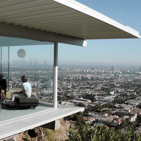
Los Angeles, where Margreiter spent at least six months each years between 2001 and 2006, provides the locus for several works which reference architectural icons: Pierre Koenig’s Case Study House #22, immortalized in Julius Shulman’s elegant nocturnal image shot on May 9 1960 and later published in Harper’s Bazaar; John Lautner’s extraordinary Sheats-Goldstein residence, built, like the Brühlzentrum, in 1963 and the ubiquitous set for a plethora of films, ranging from Charlie’s Angels (2003) to The Big Lebowski (1998). Whether in the guise of Hollywood cinema, magazine features or TV soaps, photography is the vehicle through which these residences have gained renown verging on celebrity. (Moreover, given that in their roles as film-sets or as locations for photo-shoots for fashion and advertising spreads, photography generates the income that pays for their maintenance and preservation.) Margreiter’s film installation, 10104 Angelo View Drive, 2004, explores the perverse relations that link architectural forms that move and furnishings that are fixed in Lautner’s spectacular residence as a means to speculate on ways in which the real and fictional lives of trophy architecture become interdependent in the collective cultural imaginary. By contrast, Original Condition, 2006, a series of framed advertisements, reflects on the shifting ideologies which, in little more than a decade, have transformed many Case Study houses from neglected even dilapidated residences into the preferred homes of the intellectual bourgeoisie, artists included (3).
At first sight, the inclusion of Poverty Housing. Americus, Georgia, 2008, (and made in collaboration with Rebecca Baron) strikes a discordant note in this company. However, fictive reproduction is central not only to Margreiter’s projects based on Leipzig’s utopian social housing and Los Angeles’ glittering fantasies, but to the very identity of this architectural theme park in rural Georgia. Shot in documentary style with long static takes, the 35 mm film installation records full-scale simulations, based on photographic images, of shanties in South African slums that are home to an impoverished black population. As a tourist attraction this singular theme park may have been designed to prick the consciences of its neo-liberal visitors yet it cannot escape aesthetic delectation, as this lapidary film makes clear.
Not polemic but description was the rhetorical mode Margreiter chose when conceiving this exhibition (4). Her disarmingly restrained timbre is nonetheless inflected with an incisive gender politics that has variously informed her practice over the past decade. Here it is perhaps most evident in the conjunction of subjects that fall loosely under the rubric of architecture: housing (both public and private), space (domestic and social), interiors (psychic and physical), display and exhibition (5). Theoretical and practical conundrums intrinsic to the preservation/destruction dialectic as outlined by Koolhaas are restated in Description. Clearly at issue in this ensemble of works, they are not, however, articulated as binary alternatives: rather, they are presented as fundamentally incongruent. Margreiter thereby opens up alternative ways of conceptualizing such questions. Key, for her, are the forms in which they are represented and, consequently, the terms in which their discursive field is mapped. Seeking neither to theorize nor historicize the problematic of preservation/destruction, she offers instead models that can serve as heuristic devices — as ways of unpacking — socio-cultural representations which shape and govern the built environment.
(1) Ref. Jeremy Aynsley, “News From Elsewhere”, Journal of Design History, 4, 1, 1991, pp. 43-47.
(2) It was launched in Spring 2009 at http: //awp.diart.org/margreiter/alphabeth. Html
(3) These modest houses were the product of a rare initiative in post-war California, to provide inexpensive well designed housing at a time when most modernist architects found themselves designing luxury residences for the Hollywood elite.
(4) Among the definitions of “description” provided by the Shorter Oxford English Dictionary (1970), are the following: “the combination of qualities or features that marks out or describes a particular class; hence, a sort, species, kind or variety” and “tracing out or passing over a certain course or distance”.
(5) Each of the four mobiles is named for a curator or critic closely associated with the zentrum project in one of its various manifestations. Issues of display and exhibition are foregrounded in Pavilion, Margreiter’s project based on the building in the Venetian Giardini, designed by Joseph Hoffmann in 1934, in which the Austrian national contributions to art and architecture biennales are presented.
