The Academy of Fine Arts of San Fernando (Madrid) pays tribute to the unknown history of typography in Spain through the exhibition “Imprenta Real. Fuentes de la Tipografía Española” (”Royal Printing. Sources from the Spanish Typography”), which revolves around the origin and evolution of typographic design in Spain making a special stop at the elegant Ibarra Real: a typographic font style that for over two hundred years has transcribed one of the most important editions of The Quixote, and now jumps into the fray with its inclusion in the catalog of Microsoft.
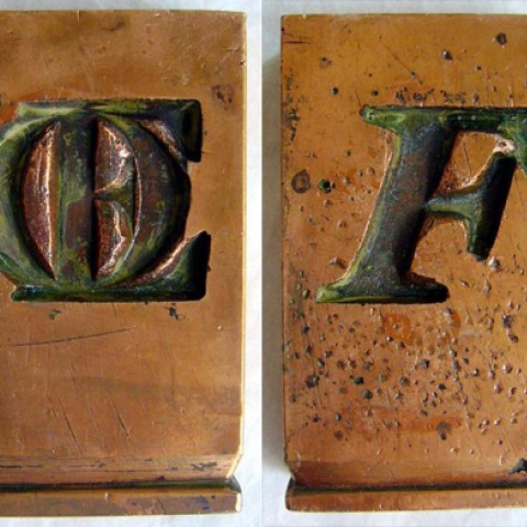
These are some of the punches, matrix moulds and Gran Canon typesetting sorts that the DHUB has given to the exhibition. The pieces were created by one of the fathers of the Ibarra Real, Jerónimo Antonio Gil and date to the 18th century.
The exhibition has passed through Madrid, Chile and continues its journey until the 24th of January at the Museo Regional de Guadalajara in Mexico.
”Royal Printing. Sources from the Spanish Typography” revolves around the origins and the evolution of Spanish typographic design and shows the tools (molds and punches) that were used to print typography of the era on antique books such as El Quixot, 1780 the books of Ramón de la Cruz, and La Conjuració de Catilina by Cayo Salustio. As well you will find digital fonts and interactive books that aim to recuperate and re-evaluate the heritage of Spanish typography.


