However, the epicenter of Arquid's project truly resides in the use of color. In construction, each color symbolizes each of the phases of production. These, by being integrated in an orderly manner both outside and inside the building, allow users and visitors to know the route of the product, all without having to leave the complex thanks to the walkway. All this without losing sight of the vast cocoa fields from which they extract the raw material for their chocolates.
Description of project by Arquid
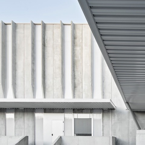
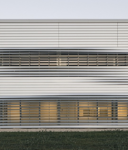
Idilia Foods project, chocolate factory located in Parets del Vallès, Barcelona, was born from the need of extending the production but respecting the existing buildings. The project gets to unify the entire complex by using on the new building the same precast concrete panels for the facade that the old ones have, a new gangway and adding some colors over the facade related to the corporate brand identity, that goes from yellow to red as it was a new sunset.
Beyond the building itseld, this project is directly related with the importance of the architecture work in industrial enviroments, which are getting closer to cities and users.
The industry is getting cleaner, chases to be open to visitors and usually lays in areas as big as small cities, what proves the necessity of the architecture and urbanism to take part in its design.
The system, construction elements and materials used in Idilia are proof of this new clean industry, designed for users and visitors. The new ganway, built to connect the old and the new building, emphasizes the importance of both workers and visitors paths, since it allows to know all the product phases with no need of going through the outside, keeping the pureness of the industrial process.
Each color of the project is related with each pahse of the production, becoming a guide of itself, both in the exterior and the interior. On the outside, the colors are placed over the wings generated by the concrete panels shape, framing the relation between the facade and the lines of the cocoa fields where the raw product comes from.
On the inside, the brightness is the protagonist thanks to the contrast with the dark open ceilings and the white materials that reflect the natural light that comes through the big polycarbonate plaques.
The utilities, joinery and rest of elements are also used to participate in the color plays, turning themshelves as well into powerful tools of brand marketing.
