Description by AMO
The Image of Europe is at once a celebration of the European Union's accomplishments and an exploration into the EU's enormous untapped potential. It marks a new stage in the Europe's evolution – a denial of understatement in favor of inspiration and engagement. From now on the EU will be bold, explicit, popular...
EU Iconography
Following the Nice Summit in May 2001, the President of the Commission, Romano Prodi, and the Belgian Prime Minister, Guy Verhofstadt, invited a group of intellectuals to two brainstorming sessions to discuss the expectations, needs and functions of Brussels as capital of Europe. The final report summarises the main ideas and proposals resulting from those meetings. It aims to contribute to and inspire future decision-making.
The key idea resulting from the exercise was that the European capital should not follow the example of national capitals. There was wide consensus among the participants about this. The European capital – still in the making – should be a stable but “light” capital, linking the diversities that lie at the heart of the European project. This should be achieved through exchanges and cultural contacts rather than through a reduction of differences and the establishment of hierarchies. Networking could act as unifying principle. The European identity should be conceived as a plural one. The communication about the European capital needs to be more attractive and consistent with these guiding ideas, keeping them in mind when selecting ideal or physical representations.
AMO addressed Europe's presence in Brussels through the architecture of its institutions, but also went a step further, addressing Europe’s representation at large: its symbols, the visual language of its communiqués, its media presence... AMO found Europe’s representations to be mute, limp, anti-modern and ineffective in an age dominated by mass media. They went on to suggest a direct relation between the absence of a visual language – Europe’s iconographic deficit – and a widespread ignorance about the activities and the origins of the EU among the general public.
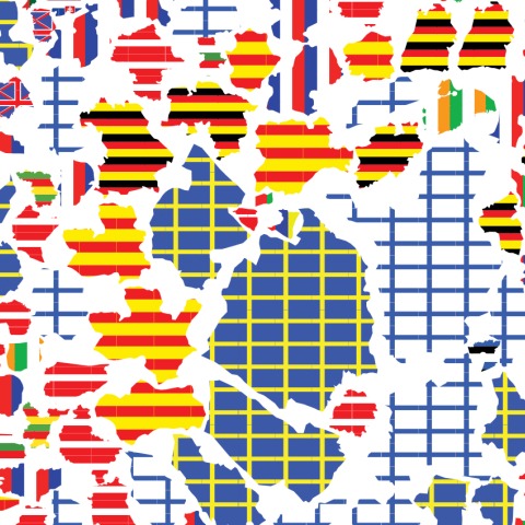
As food for thought, AMO attempted to develop a visual language conveying Europe’s essential idea in a direct and powerful way. This operation resulted in a series of illustrations, or rather 'image-bites,' of which the barcode is one. The barcode elongates and merges the flags of current EU member states into a single colourful symbol. It intends to represent the essence of the European project, showing Europe as the common effort of different nation states, with each state retaining its own cultural identity while sharing the advantages of acting together. Whereas the number of stars on the current EU flag is now fixed, the barcode can be expanded with new members joining the EU.
EU Exhibition
To mark the occasion of the Netherland's 2004 Presidency of the European Union, AMO was asked by the European Commission to create an exhibition in Brussels (which then travelled to Munich and Vienna), ‘The Image of Europe’ celebrating an end to the EU’s inhibited iconography, its coming out…
On two panoramic murals – concentric circles of 60 and 80 meters in length – the evolution of "Europe", as a concept, identity, and political reality, is sketched. The inner ring presents the history of Europe, from continental drift to the Madrid bombing, as an accelerating sequence that gradually gains detail as it approaches the present. Beginning as a sparsely populated archipelago, the pivotal moments of early development – the age of the dinosaur, the Neanderthal, Ancient Greece, Rome – inhabit discreet islands. Arrows indicate the critical interactions with the outside world, particularly with Africa and Asia, that enriched Europe's early civilizations. From there the history plots a cyclical alternation between 'good' and 'bad', idealism and zealotry, through the spread of Christianity, the emergence of modernity, the rise of colonialism and industrialization, nationalism, and eventually the catastrophic violence of the 20th century. Our current moment of uncertainty, affluence, and opportunity provides a provisional climax.
The complexities of Europe's past provide a tumultuous foreground against which the outer ring narrates the history of European integration. Starting shortly after World War Two, the story of the European Union – its watersheds and breakdowns, heroes and villains – is, for once, boldly declared. The outer ring attempts to undo 50 years of calculated quietness by turning the EU's non-events into celebrations, its nobodies into heroes, its drabness into grandeur. The story closes somewhere in the 2020s, in a speculative conclusion on Europe's possible future(s).
In 2005, in cooperation with the European Commission in Brussels, the Haus der Kunst presented AMO’s visualisation of the new Europe in Munich. In each of the three halls, one theme was featured: the history of Europe, the history of the European Union and the history of the Marshall Plan. Texts and pictorial motifs by AMO were displayed on walls up to a height of 5 meters, the latest news from all over the world was projected onto a semi-transparent globe, and film spots produced by AMO for the EU were shown on the walls of the stairwell.
The exhibition in Vienna, coinciding with the Austrian EU Presidency of 2006, marked the first official use of the barcode. AMO also designed the visual identity for the Austrian EU Presidency that took place from January to July 2006. The design, which is based on the barcode, resulted in various 'barcoded' items ranging from coffee mugs to trains and was prominently used at various summit meetings
EU Reflection Group
In December 2008, with the Lisbon treaty finally close to ratification after years of torturous delays, but the European project still unsure of its future and the financial crisis unfolding, a group of 12 "wise men" convened in Brussels for the first in a year-long series of meetings. The mission of the EU Reflection Group was to consider what Europe could do, after a decade of internal wrangling over institutions and treaties, about issues larger than itself: climate change, immigration, defense, Europe's role in the world. They would report their findings to the European Council in May 2010.
Surrounded by former politicians and policy experts, AMO was assigned the role of conceptualizing and designing the report. How to make a report from an EU think tank into a momentous event announcing a bold new future for Europe in 2030?
AMO generated a panoply ideas for a popular form that the report could take in tandem with its status as a serious document of policy recommendations: a cut and paste manifesto, using the richness and trenchancy of existing agreements that bind Europe and the world; a ‘Declaration of Interdependence’, in which Europe's nations admit that they can only have influence if they continue to consolidate their power; guest-editing a section of the Guardian and other leading European newspapers; hijacking the implausibly popular europa.eu on the day of the report's publication; mobilizing action on climate change - the idea of a Europe-wide renewable energy power grid, for example - as a cause to bring Europe into an ever-closer unity; a graphic novel, inspired by the 9/11 report, to give the proper weight of drama and heroism to the EU's activities; even a text message campaign, in which everyone in the EU would receive an SMS from someone like Penelope Cruz or Peter Sloterdijk announcing the exciting conclusions of the Reflection Group…
With each new suggestion and each new mockup, the prospect of realization receded. Somehow, the failings of Europe itself - the refusal to declare ambition, the absence of decisiveness, of bold language - seemed to manifest in the microcosm of the group. After more than a year of monthly trips to Brussels, and with no funds available to produce a popular version of the report - in any format - we began instead to try to help shape its content. We suggested a coherent chapter structure and the compression of rambling paragraphs into forceful single sentences. None of this survived the final draft.
