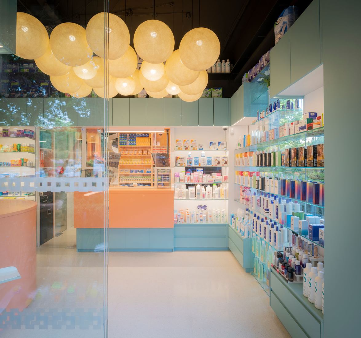
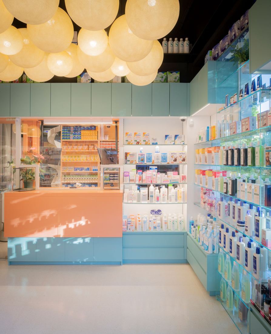
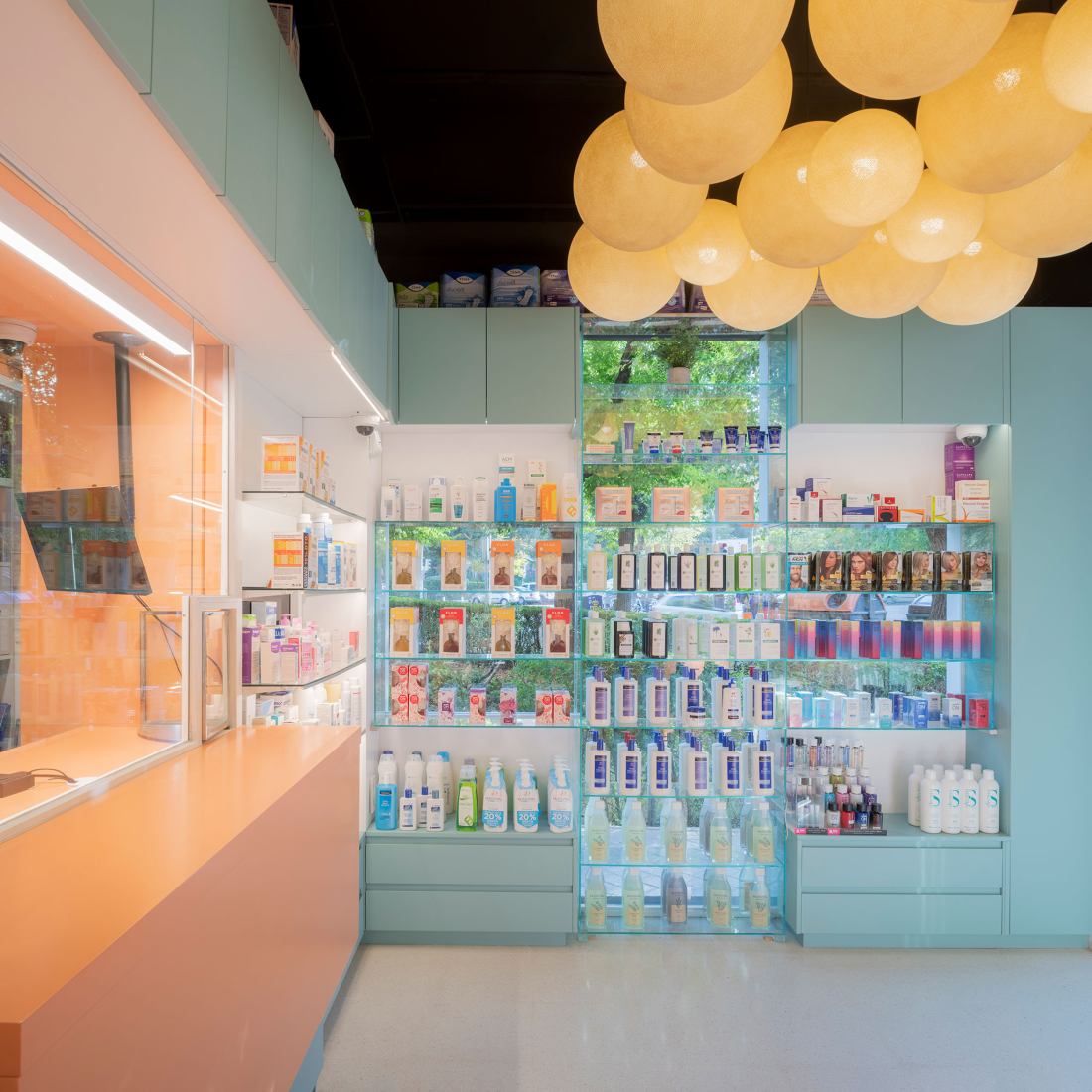
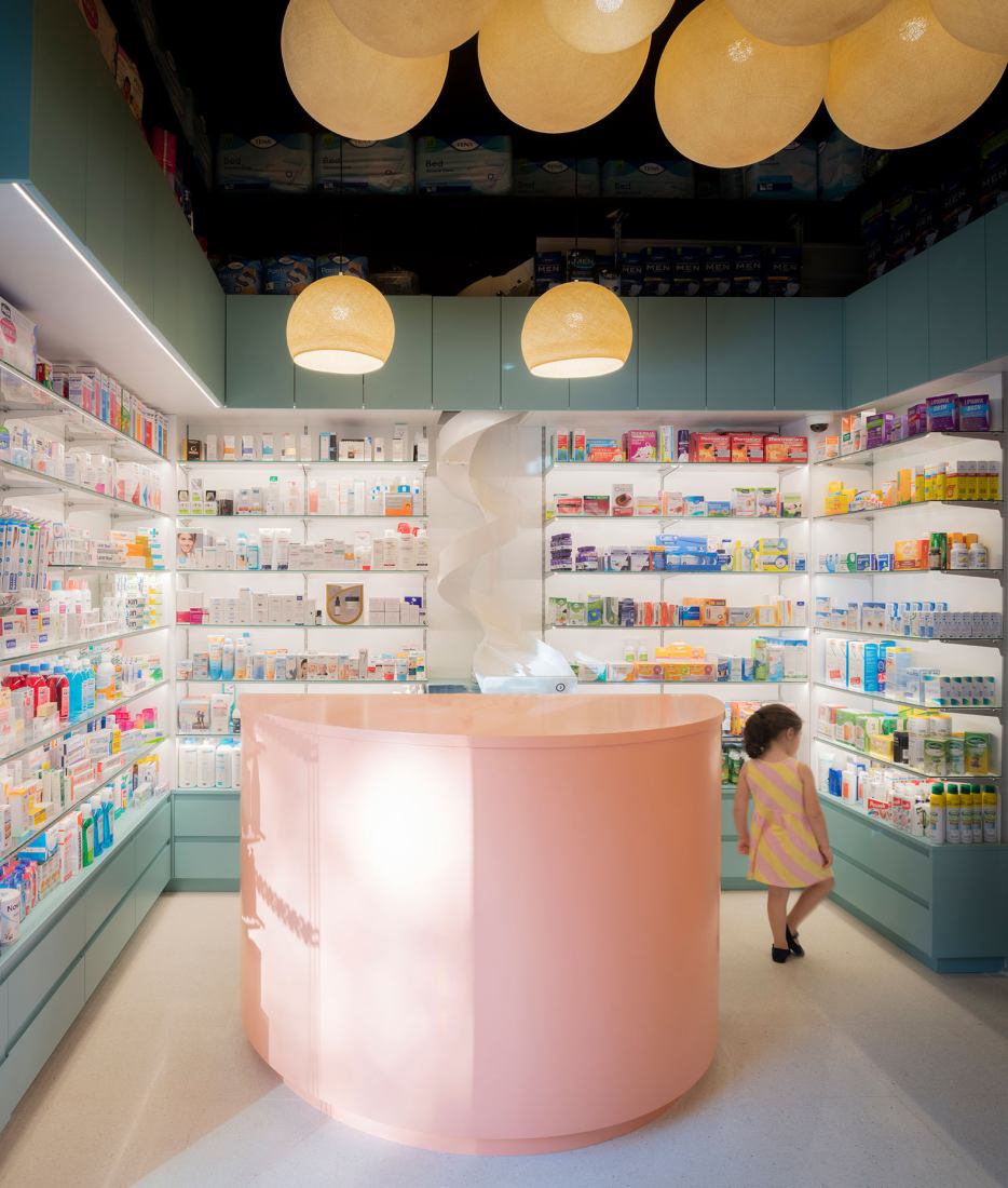
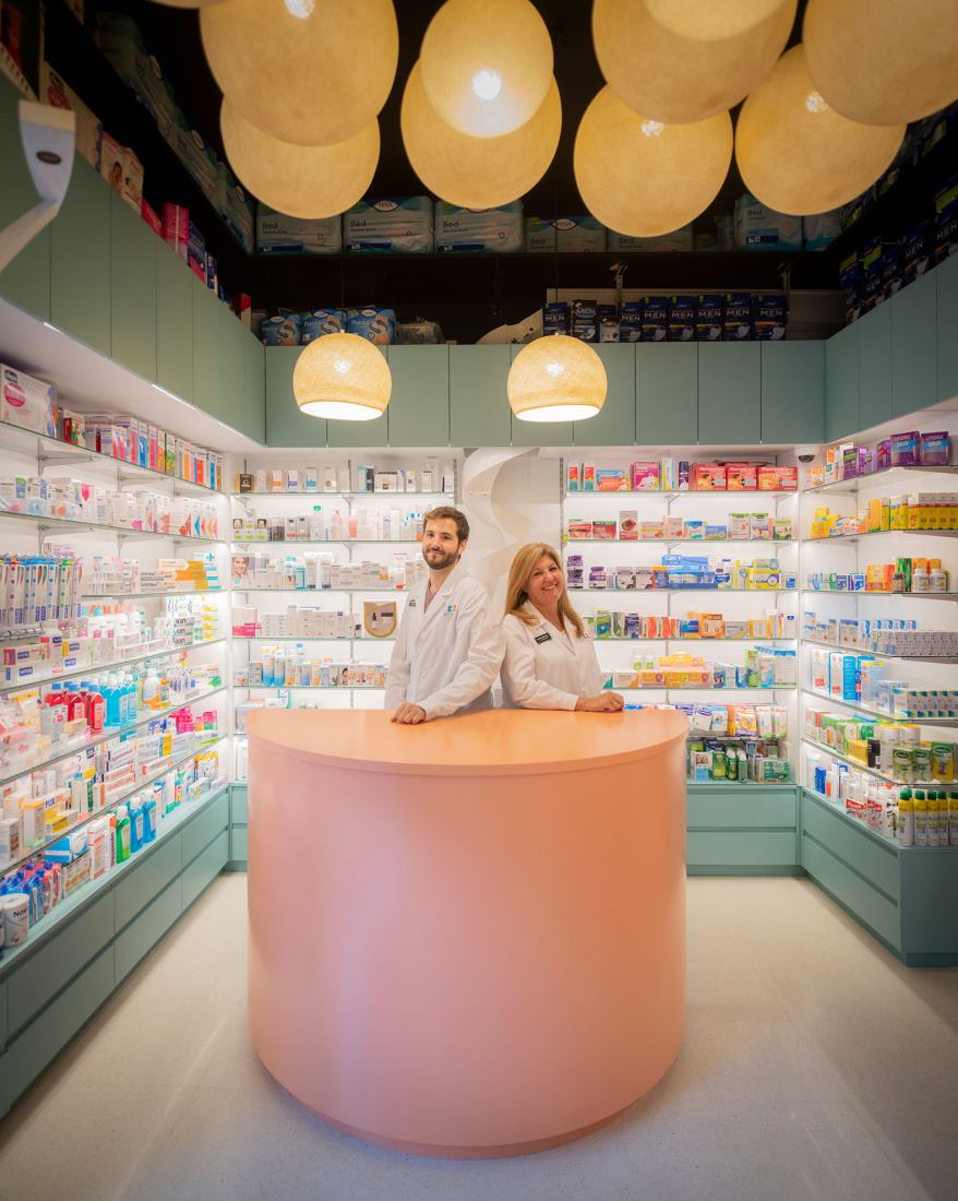
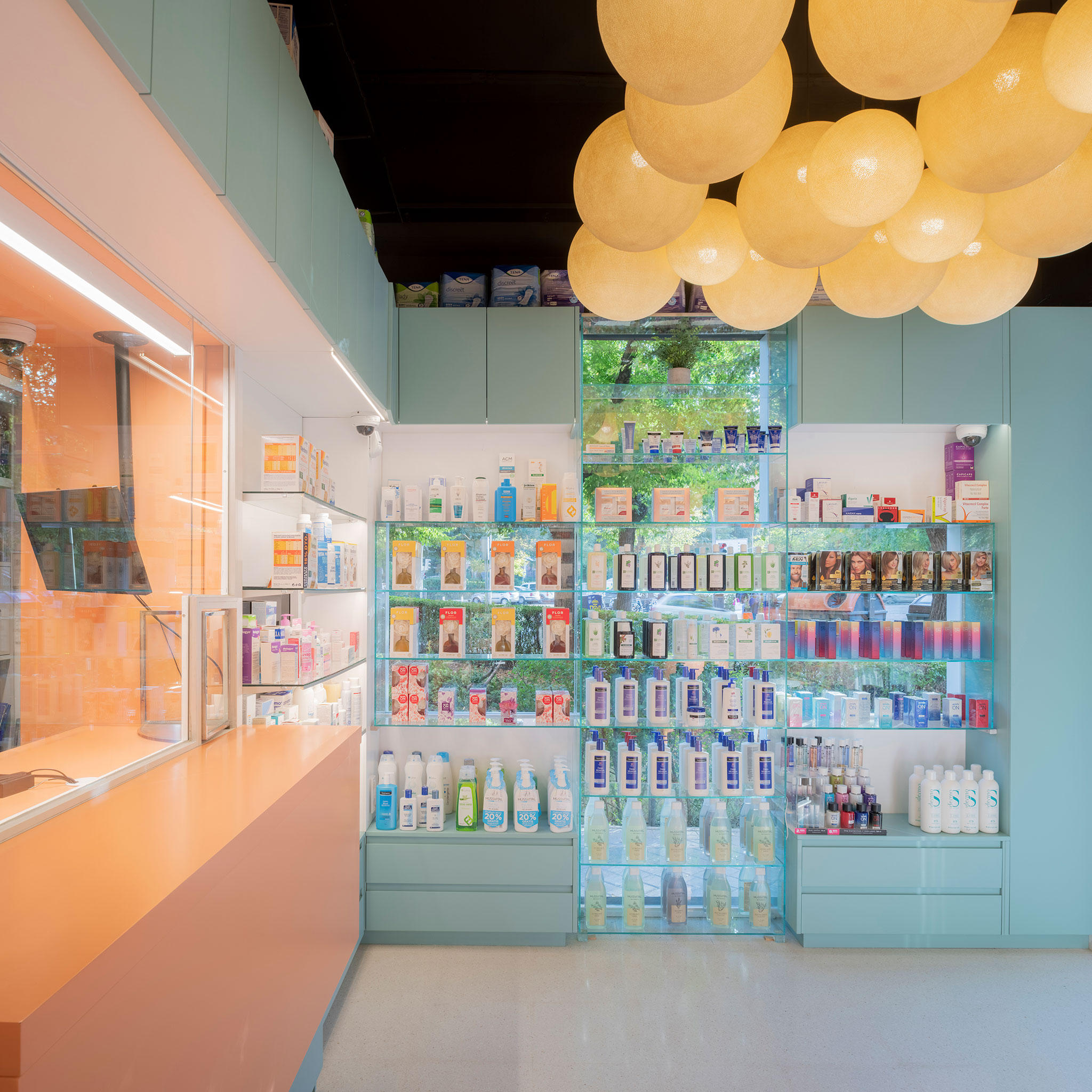
The selection of the color palette seeks to associate the space with health, beauty and well-being, moving away from the perception of the pharmacy as a space "exclusively" for selling medicines. Luminaires are placed on each shelf to illuminate the displayed product. In addition, the cloud of luminaires, which hang from the high ceiling at a height of 3 m, helps to "hide" the medicines stored at the top of the shelves.
Farmacia Artilleros by Adam Bresnick. Photograph by Amores Pictures
Project description by Adam Bresnick architects
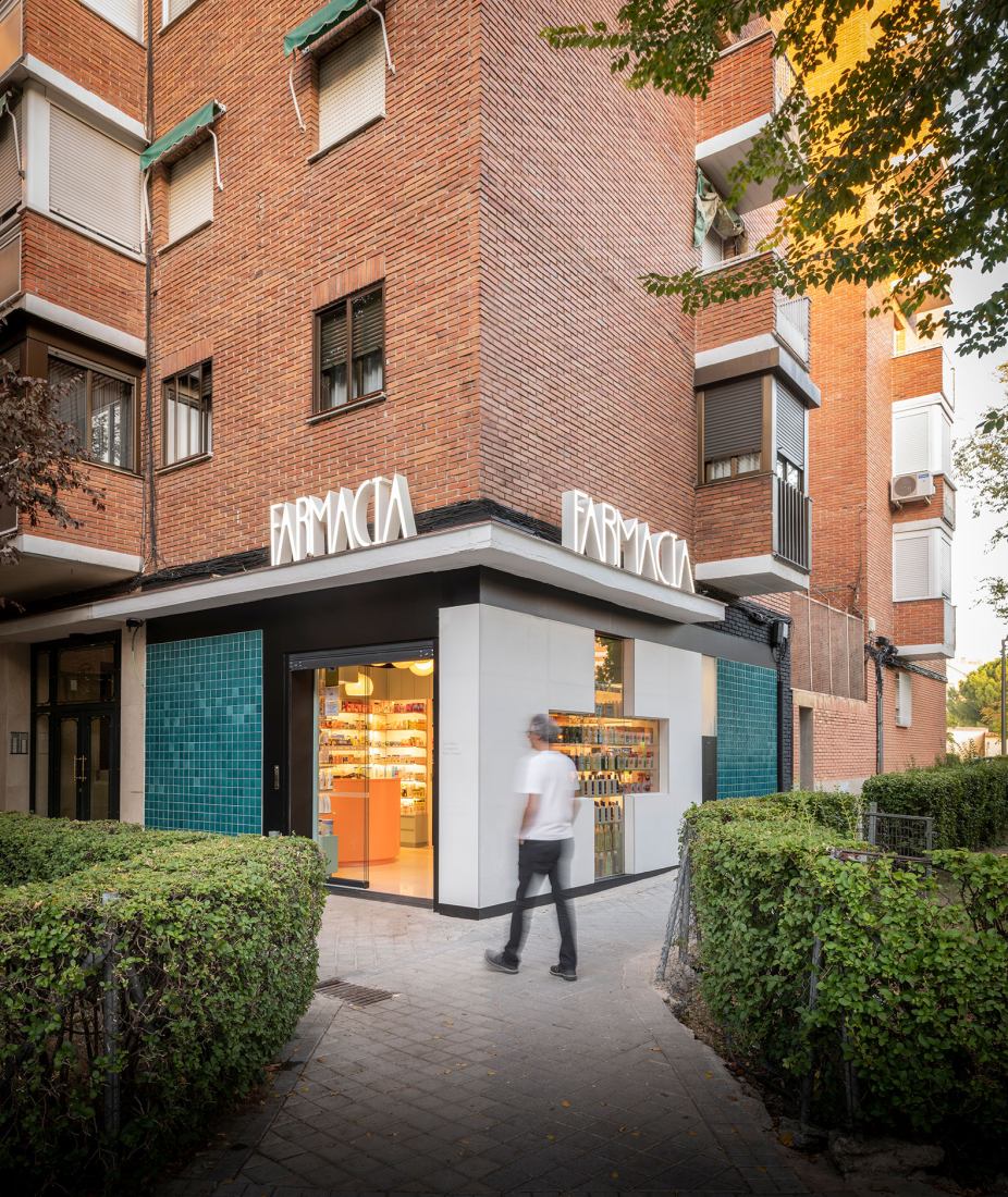
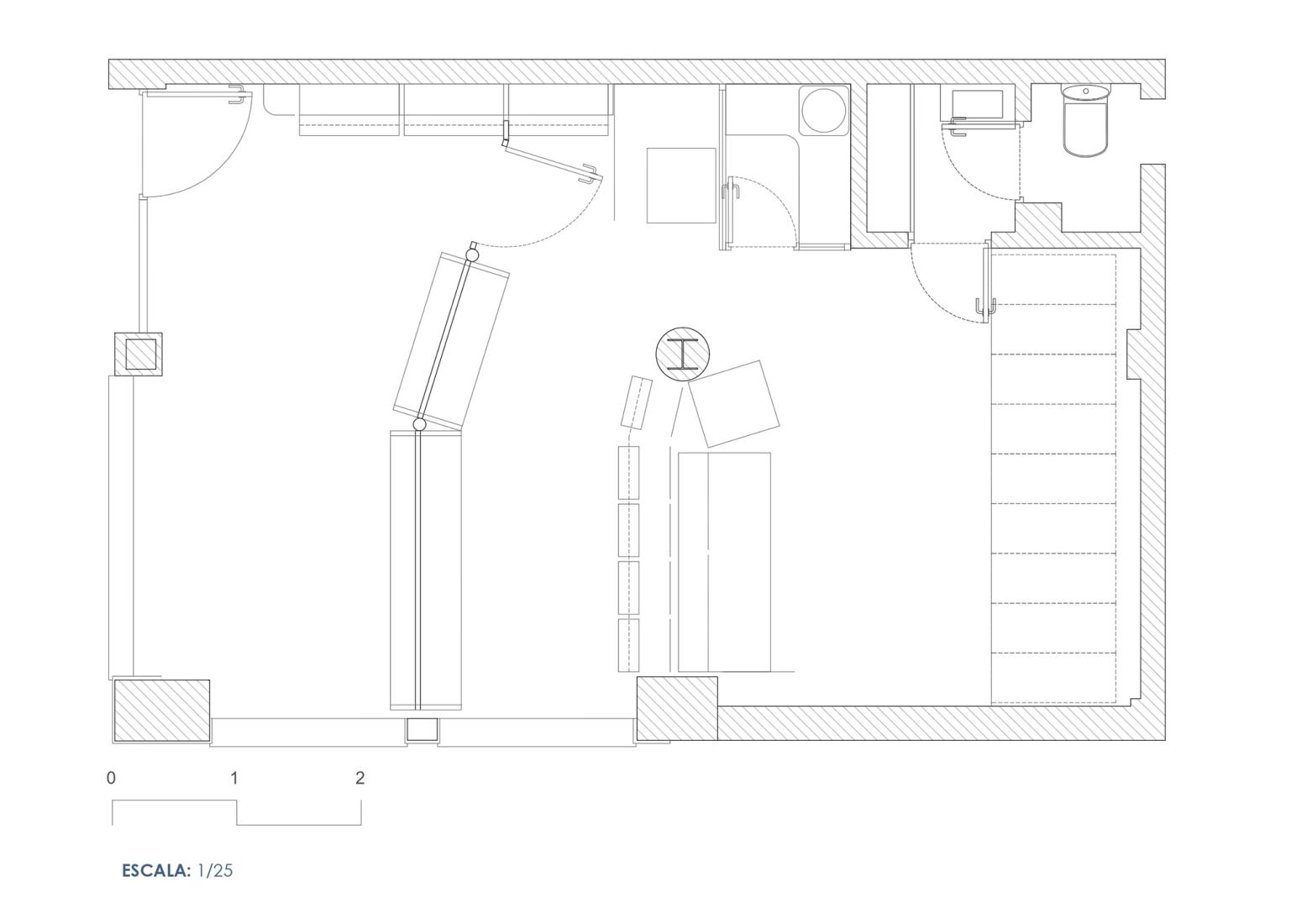
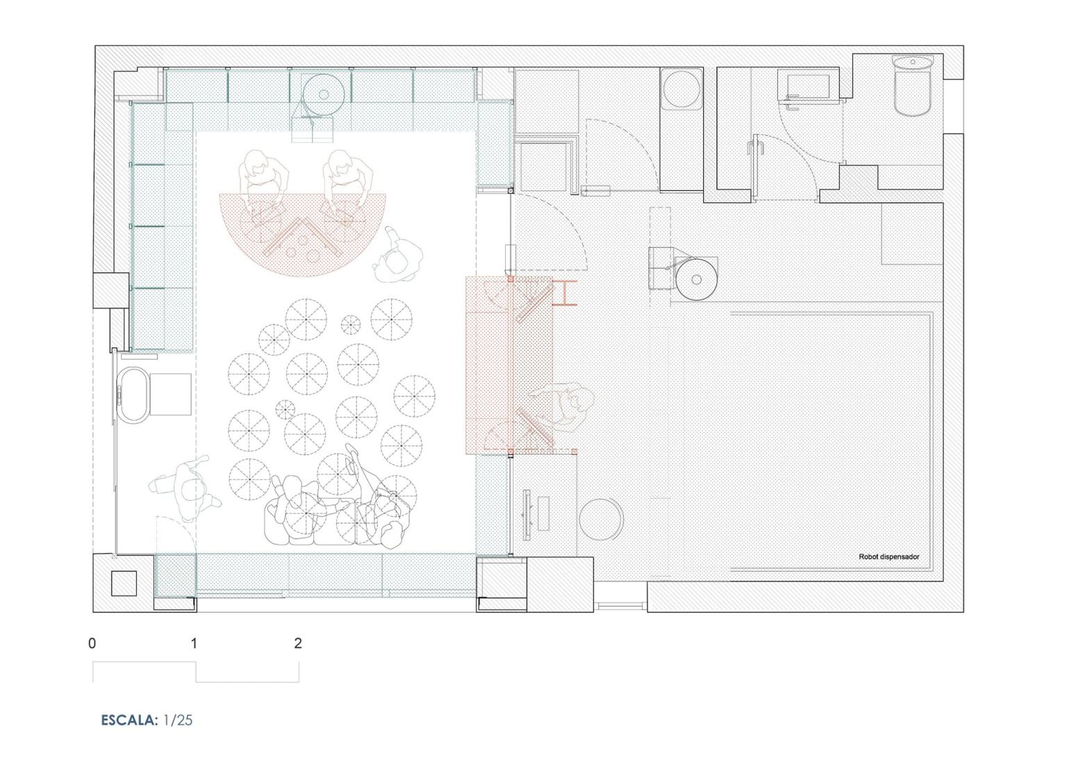
The pharmacy lacked the possibility of expanding to adjacent premises and could only grow by optimizing its storage capacity through a robot. The large dimensions of the robot (9 sqm) compared to those of the premises (40 sqm) implied a reorganization of the interior layout and the position of the entrance.
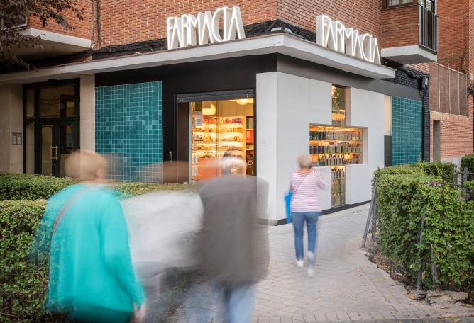
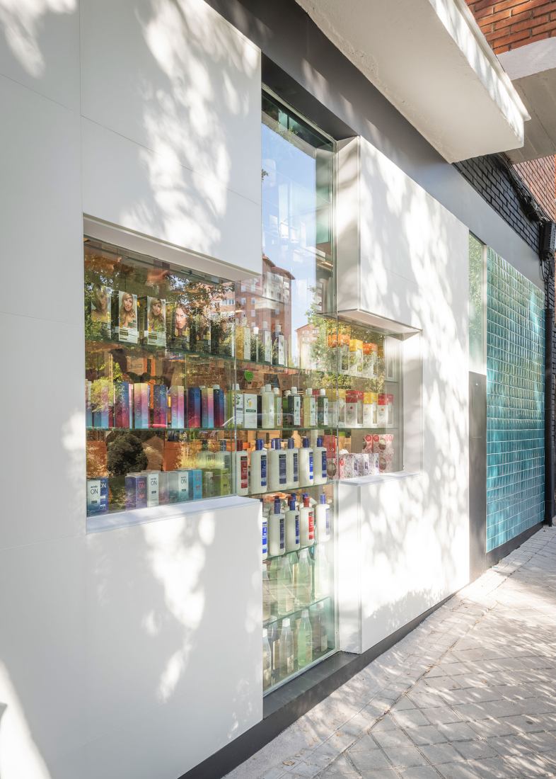
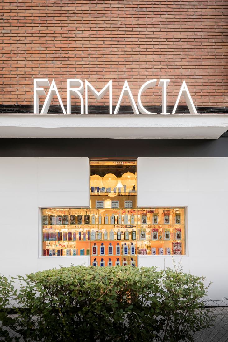
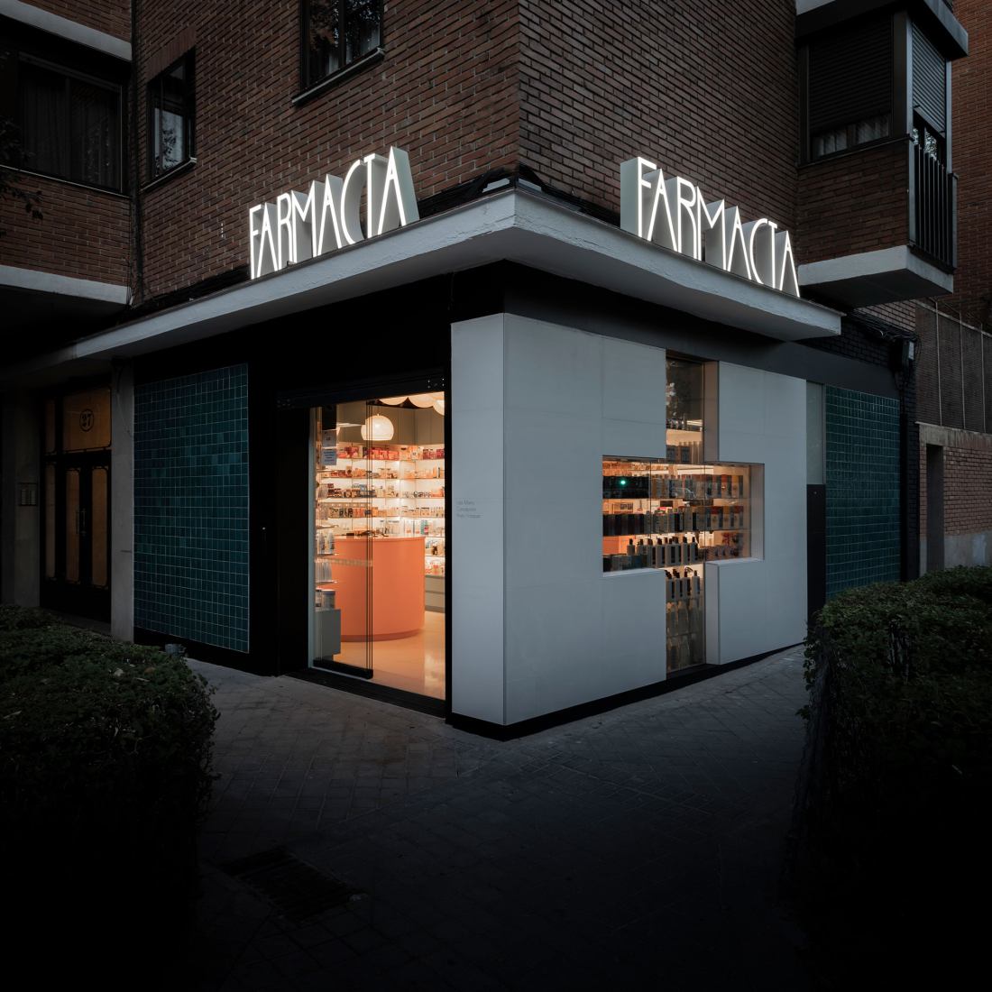
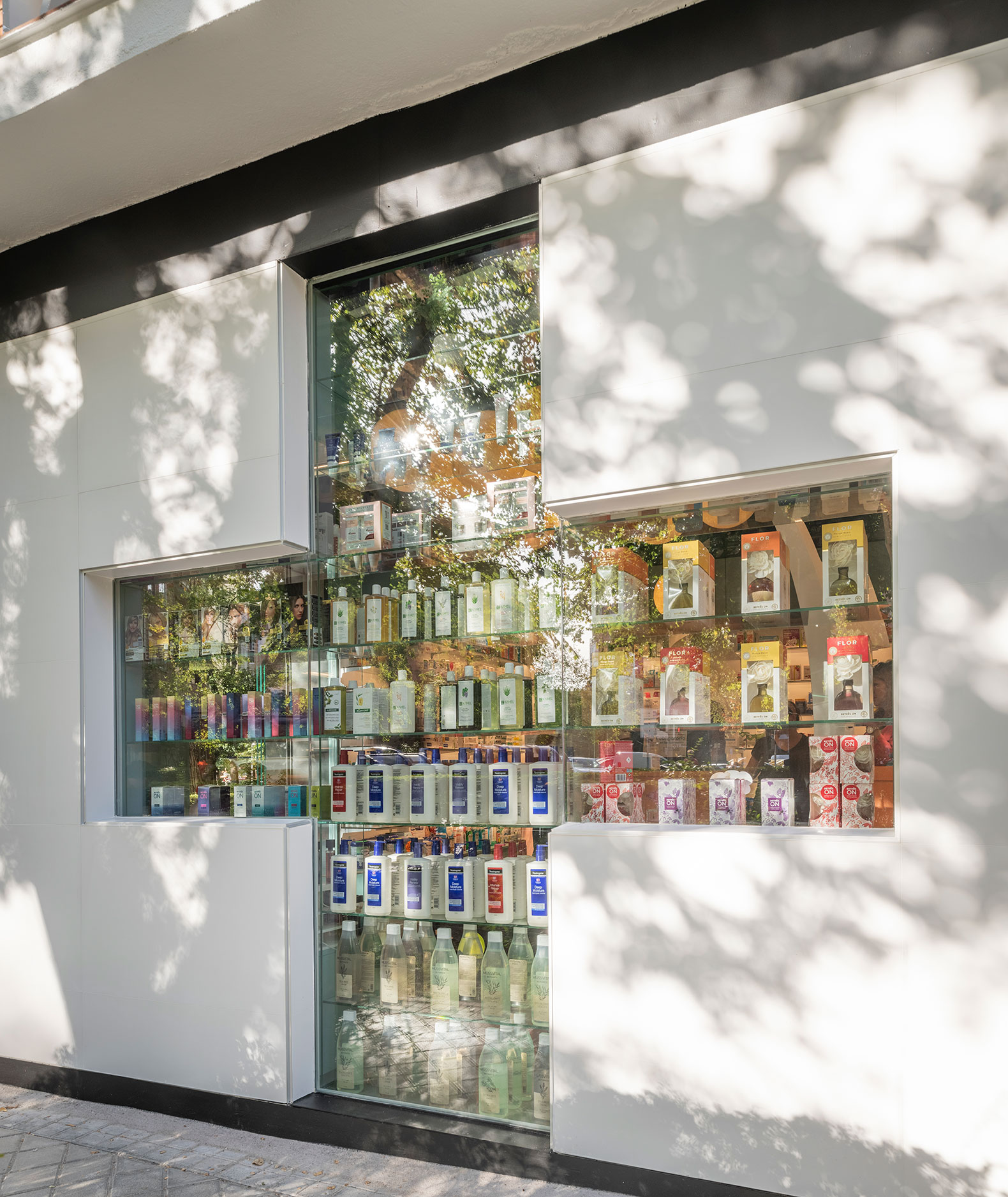
By modifying the access, it is now aligned with the pedestrian path and framed by the hedges of the adjacent green areas. At the same time, the foreshortened view of the pharmacy is prioritized, making the white volume that is pierced by the large cross the protagonist of the facade.
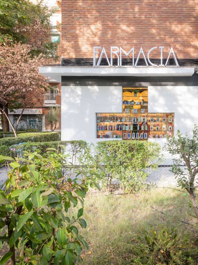
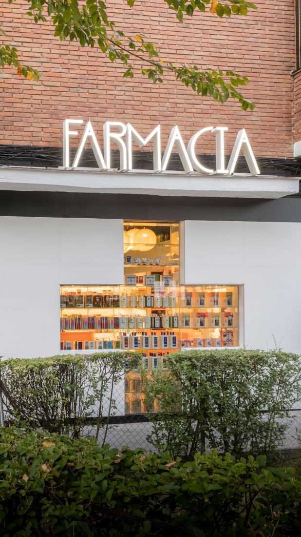
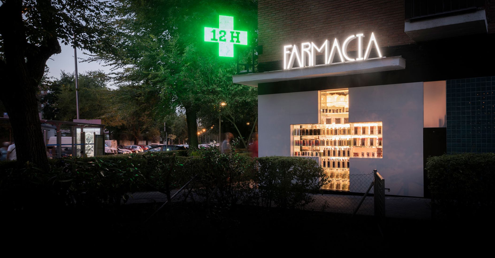
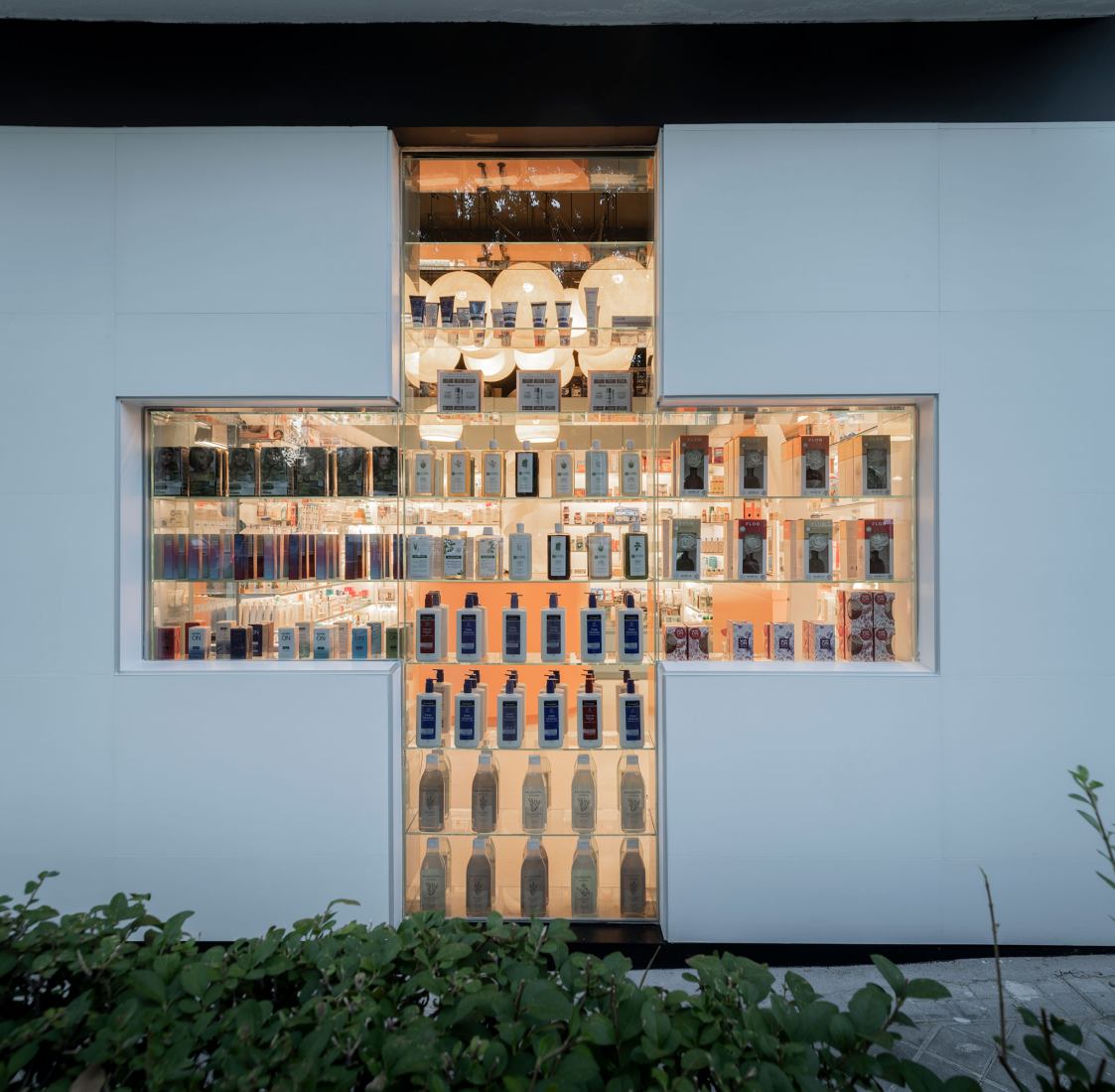
This large opening in the facade has the function of allowing the pharmacy to be recognized as such from a great distance since the opposite corner of the cross is more than 60 meters away.
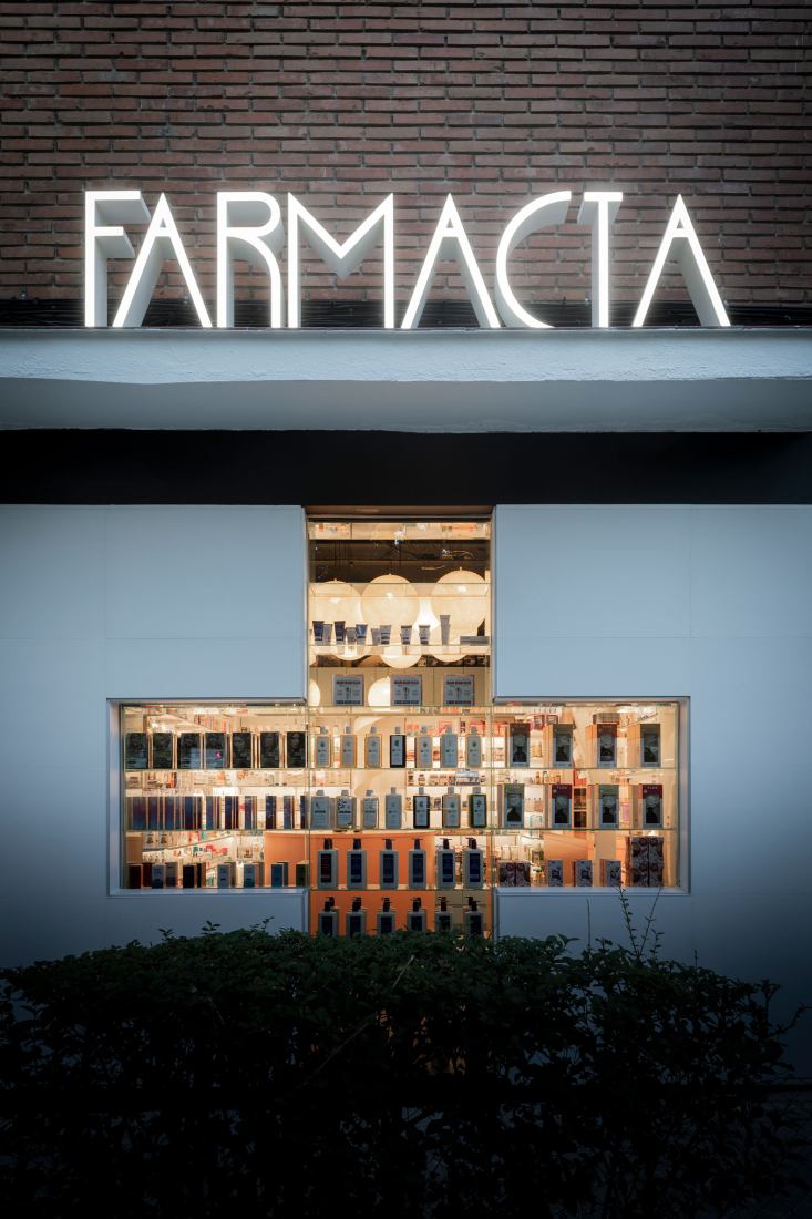
At the same time, the glass shelving in the same opening allows pedestrians walking along the facade to see the products on display.
The upper and lower black bands make it possible to solve the encounters between the white volume and the steeply sloping sidewalks without it losing its significance. It also makes it possible to organize the relationship between the two tiled panels and the large cross.

Farmacia Artilleros by Adam Bresnick. Photograph by Amores Pictures
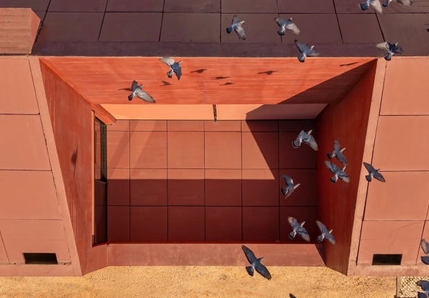
The canopy is an original element of the building that has been reinforced as a horizontal element by placing a corporeal typography of very vertical proportions on it.
The protagonist of the interior layout is a double dichotomy. On the one hand, the shortage of storage space in the congested space of the store is set against the needs of an orderly sales area with attractive colors. At the same time, the requirements imposed by the two owners clash: one of them opts to keep a partition behind the counter in a traditional manner, while the other wants to prioritize patient contact. Each of them has a counter that is true to its own characteristics.
The fact of having a free-standing counter located inside the sales area allows to increase the surface of this area and thus increase the patient's perception of spaciousness despite the small size of the premises.
Farmacia Artilleros by Adam Bresnick. Photograph by Amores Pictures
The store has a height of 3 m and has sought to take advantage of this feature for storage. The cloud of luminaires in the sales area has the secondary function of hiding the products in the upper floors when they are backlit.
The selection of the color palette seeks to associate the space with health, beauty and wellness, moving away from the perception of the pharmacy as a space (exclusively) for the sale of medicines.
The illumination of the product is produced by placing luminaires on each shelf, emphasizing the accent of light on the genre.
With all of the above, it is possible to organize a space of limited dimensions, organizing the facade on two scales and drawing the attention of the patient from two opposing conceptions.

