


Pineda Monedero and Jaime Prous Architects created a rectangular pavilion with orthogonally arranged interior divisions. The exterior consists of a white, perforated wall through which the striking colours of the interior are perceived, generating a sense of curiosity and attraction in the spectators who seek to enter it.
Each colour indicates a different space: blue is used in the main hall of the pavilion, while red is shown in the more private meeting rooms. Yellow is found in the rest of the building serving as an intermediate transitional element. The chosen colour scheme is a simile of the inhabitants that make up the city and the coexistence that exists between them.
Pavilion for Barcelona at FITUR 2025 by Pineda Monedero + Jaime Prous Architects. Photograph by Del Rio Bani.
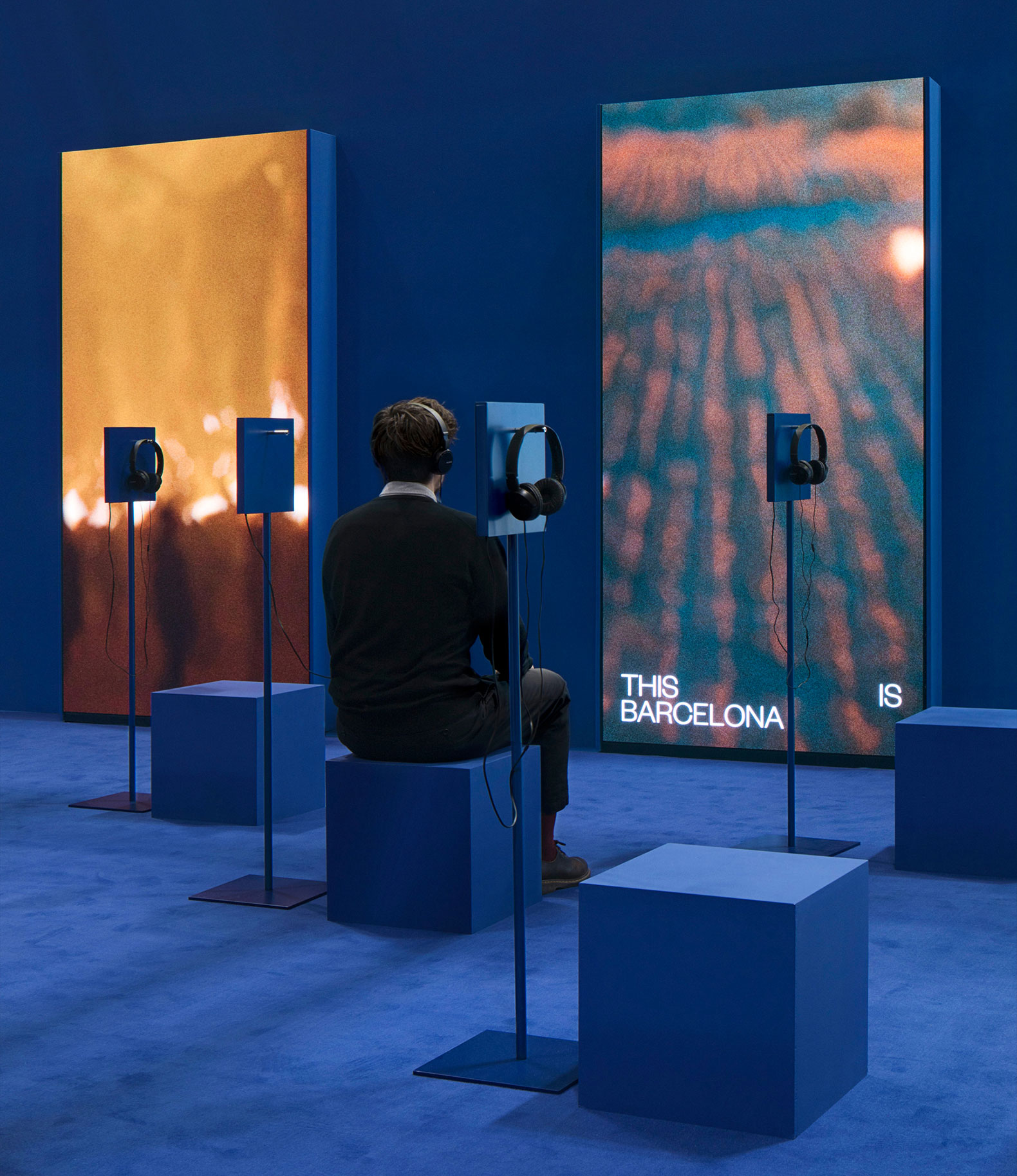
The main hall is filled with armchairs with headphones in each of them, and shows an audiovisual work in which the most popular images of Barcelona appear. The exhibition is designed to break with the stereotypes of the city through the headphones where you can listen to the lives of the people who live there. The city is shaped through the day-to-day life of its inhabitants and the different stories of each of them, not just the places that appear in the room. It is important to know the intrahistory of a place in order to move away from popular clichés.
Project description by Pineda Monedero and Jaime Prous Architects
Barcelona is participating in the largest tourism fair at a time of saturation and social tension. This paradox allows us to rethink how the city presents itself to the world, highlighting its authentic essence, overcoming stereotypes, and seeking a new narrative: "La nova Barcelona de sempre."
A white wall separates the stand from the fair. The wall is pierced by openings that make up an urban façade and allow a glimpse into the interior. The stand is not open to everyone, but rather invites anyone willing to make the effort to discover what's happening inside.
In contrast to the sober exterior, the interior is defined by three intense colors that represent spaces: yellow for the transition space, red for the meeting rooms, and blue for the main hall. These primary colors symbolize the diversity of its inhabitants and all the nuances that arise from their coexistence.
An audiovisual montage brings this new narrative to life. Images of the city are displayed in the gaps in the wall, while a series of headphones allow you to hear different testimonies from Barcelona residents explaining what Barcelona means to them. This collective narrative seeks to counter stereotypes by focusing on the city and those who live there every day.


")


. Photograph courtesy of IADE and AEHM")


