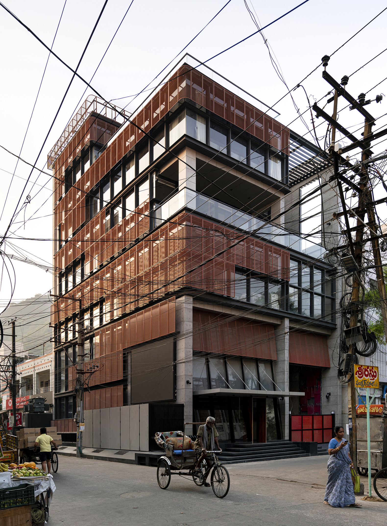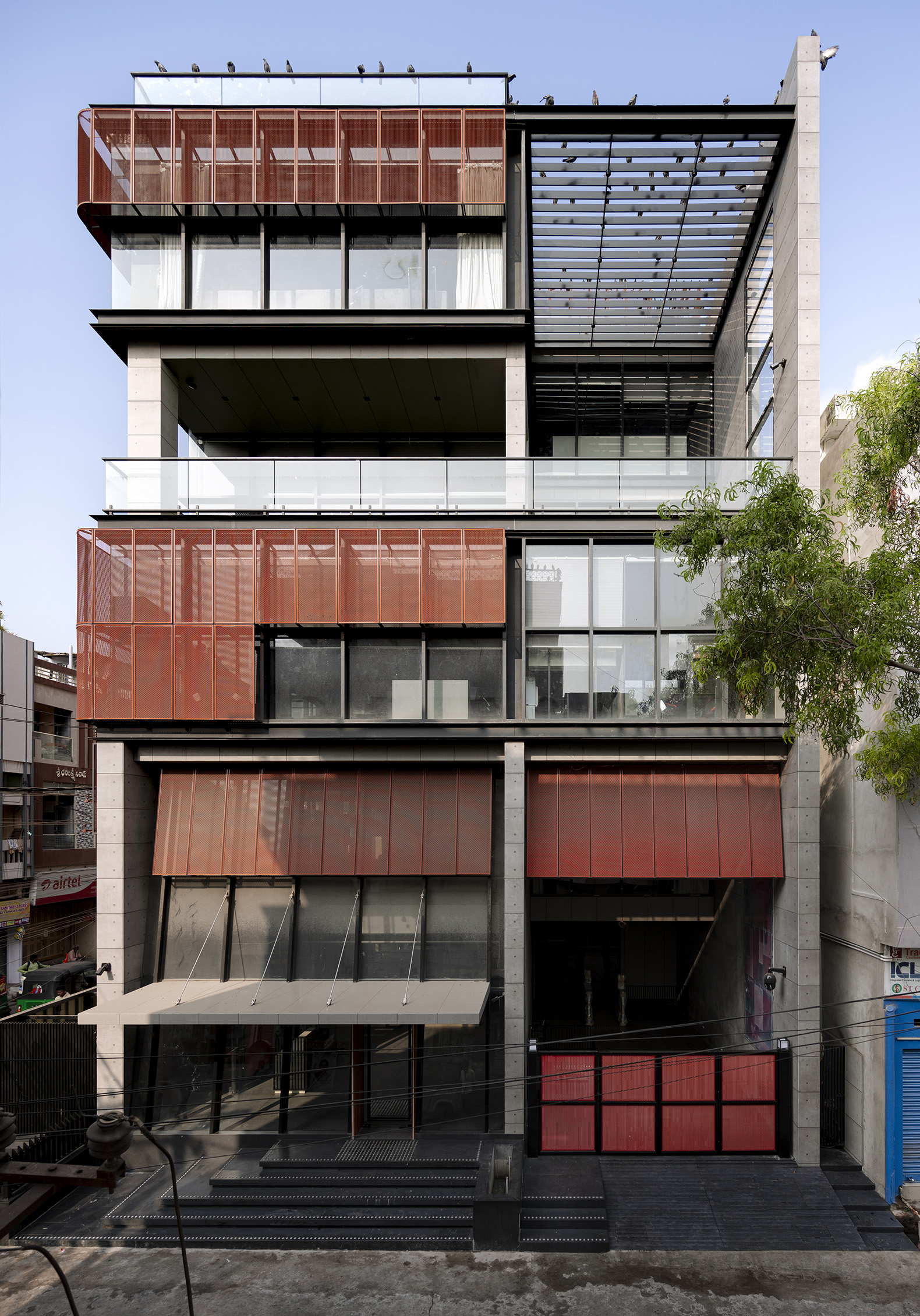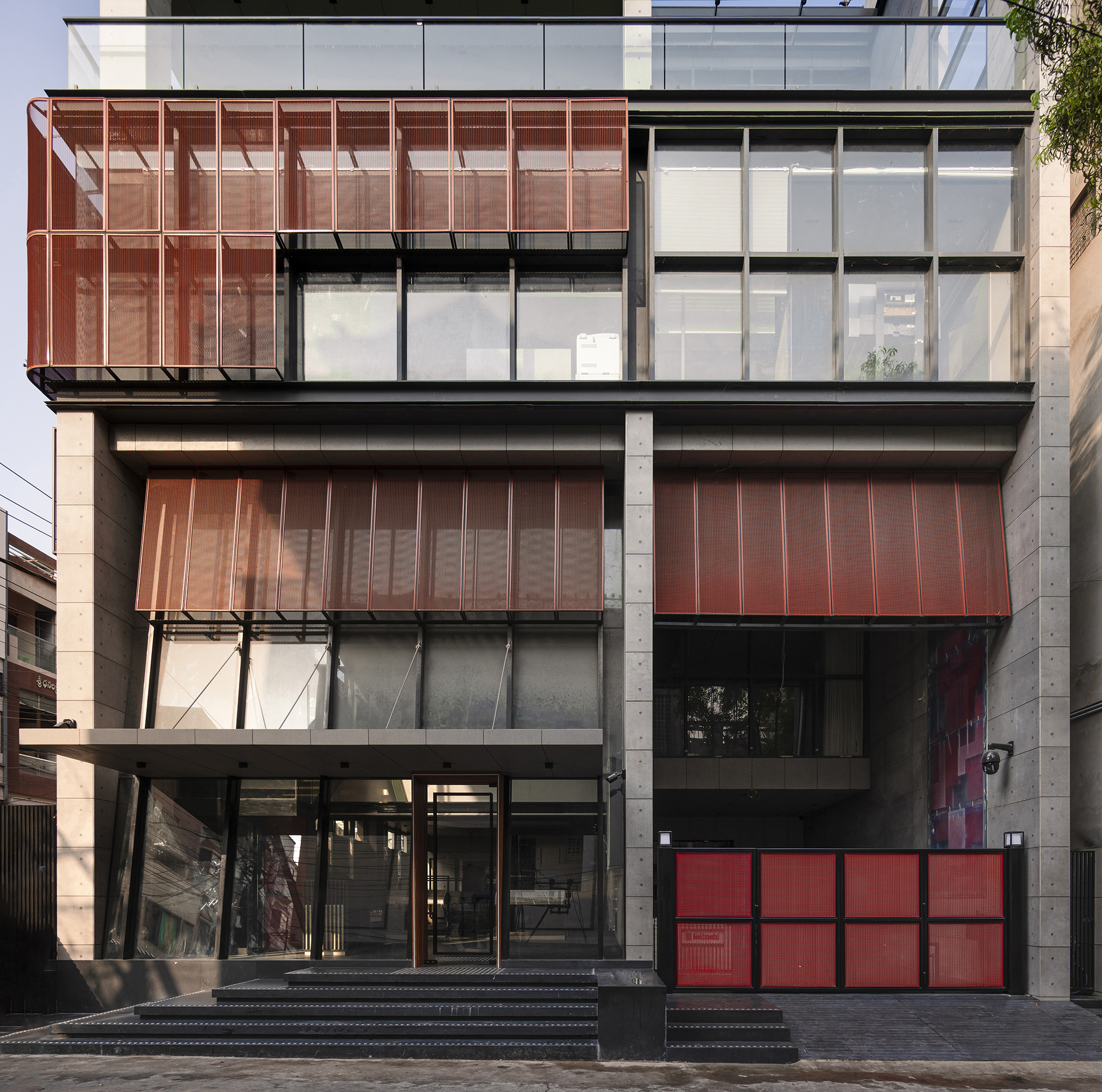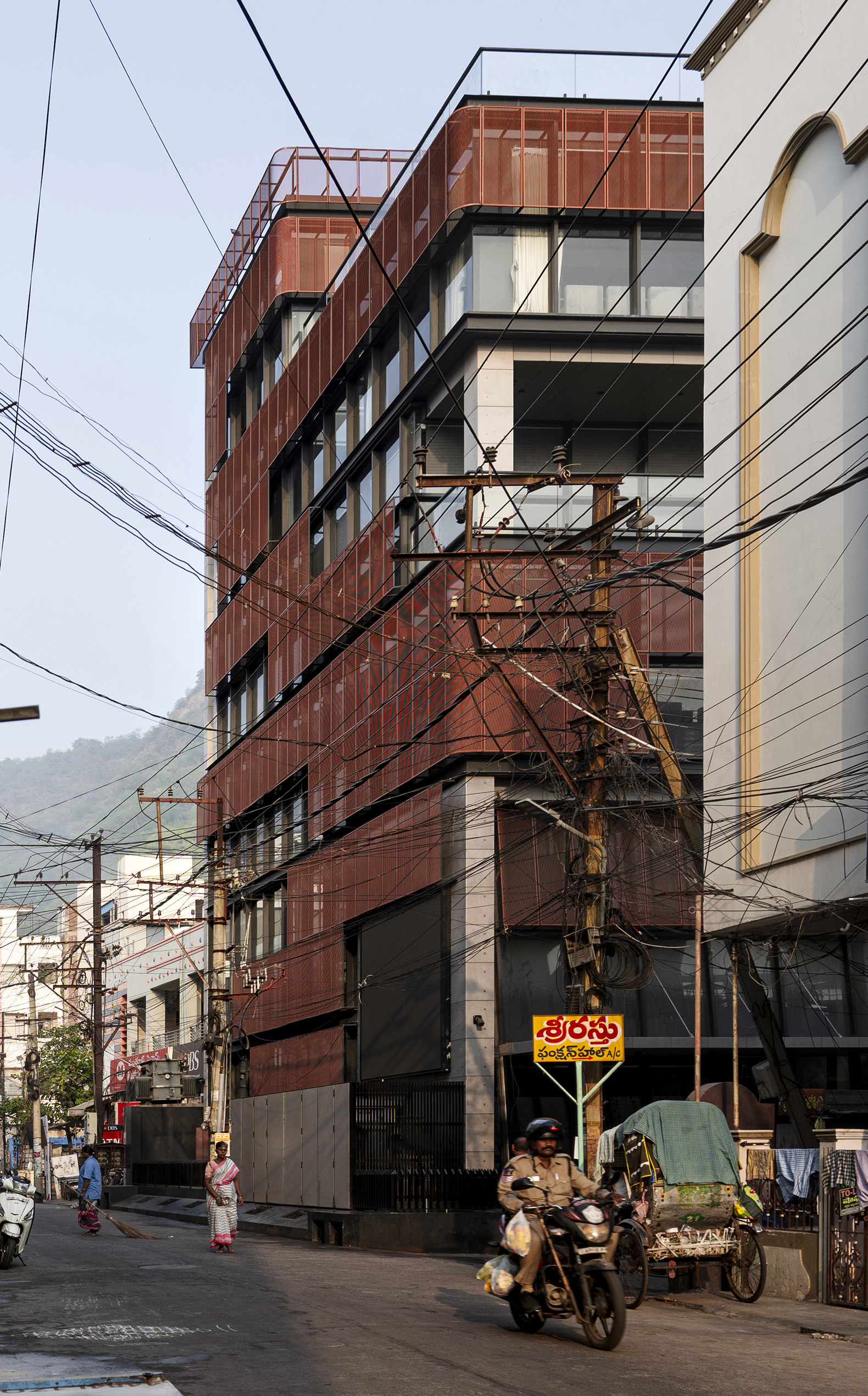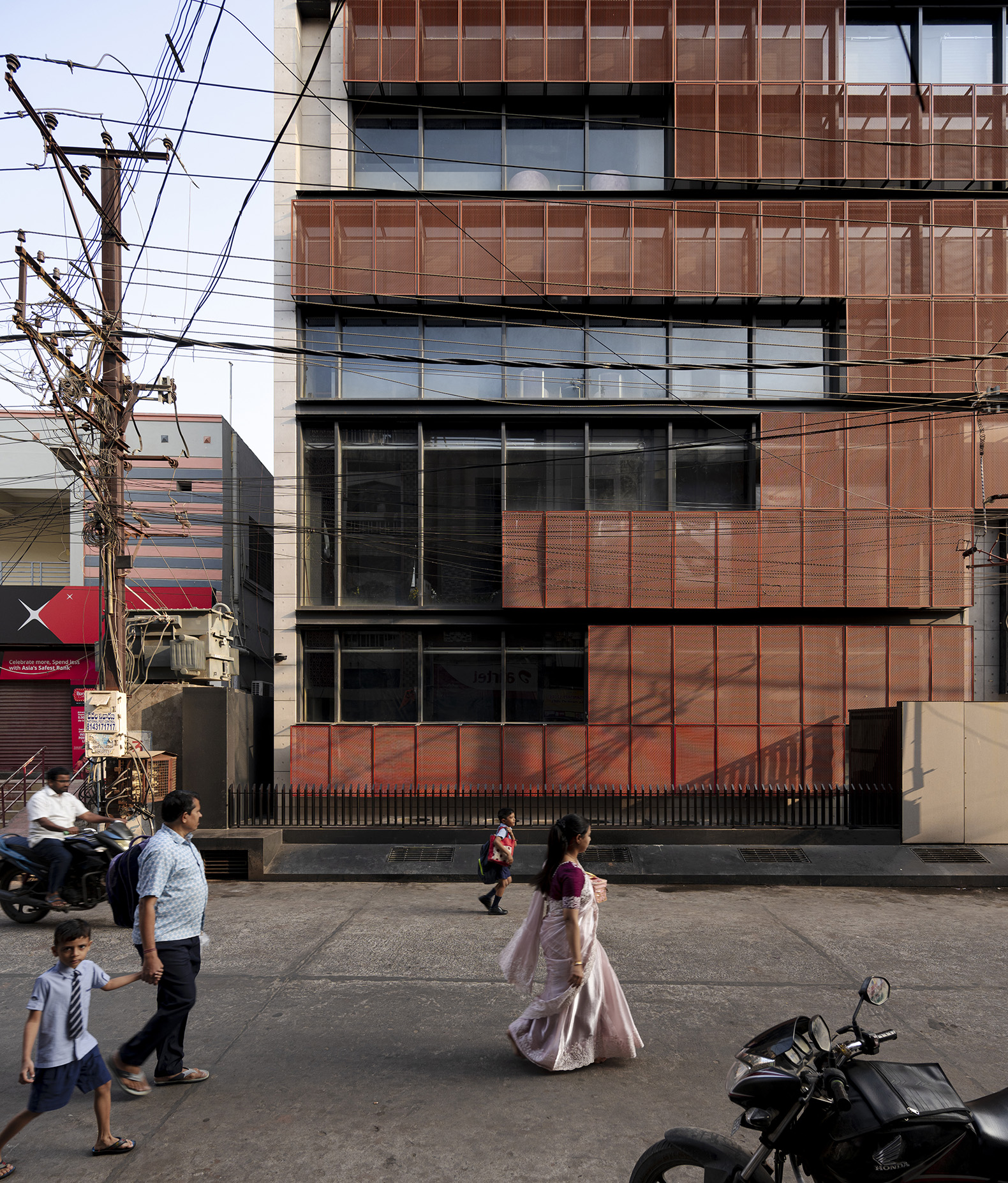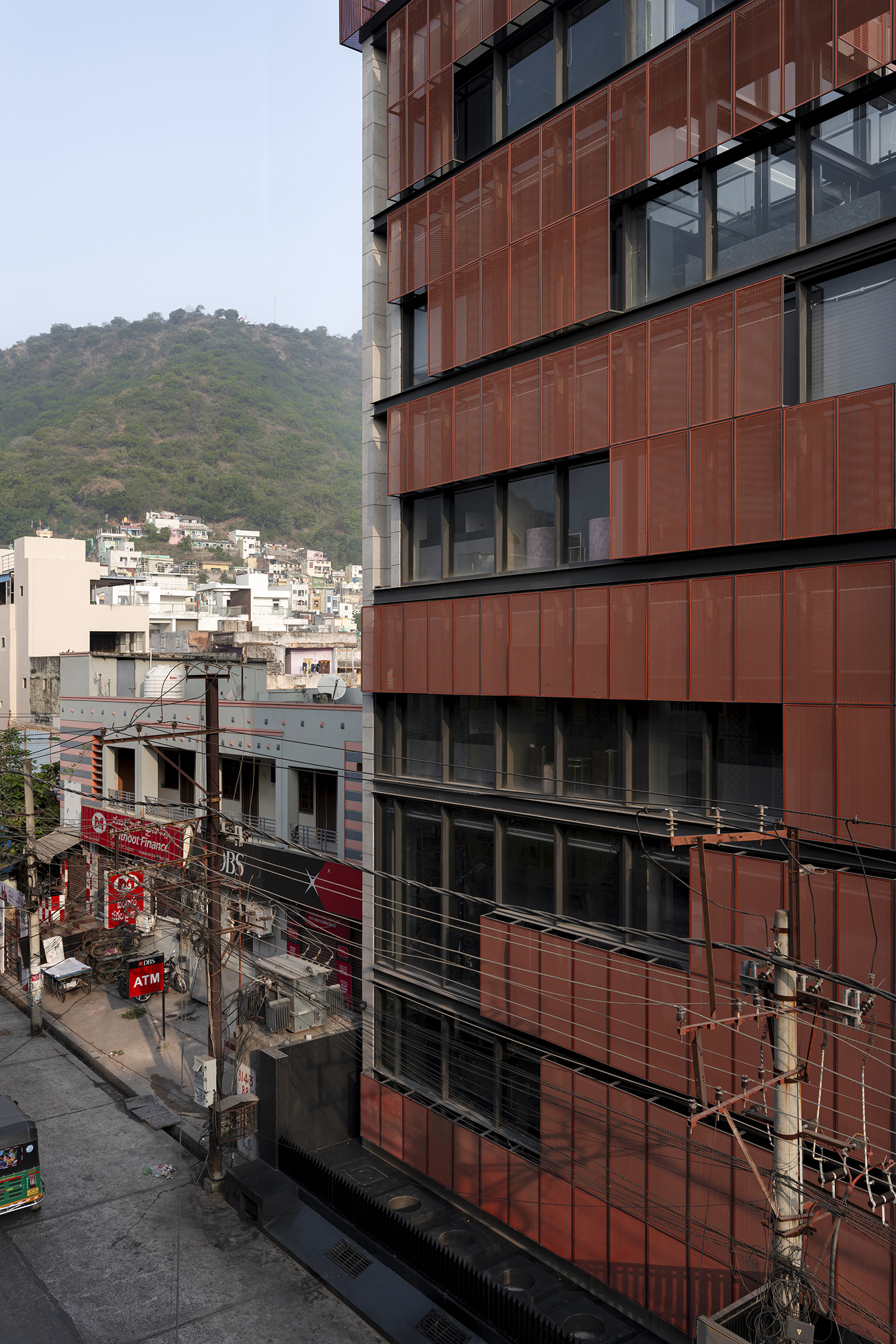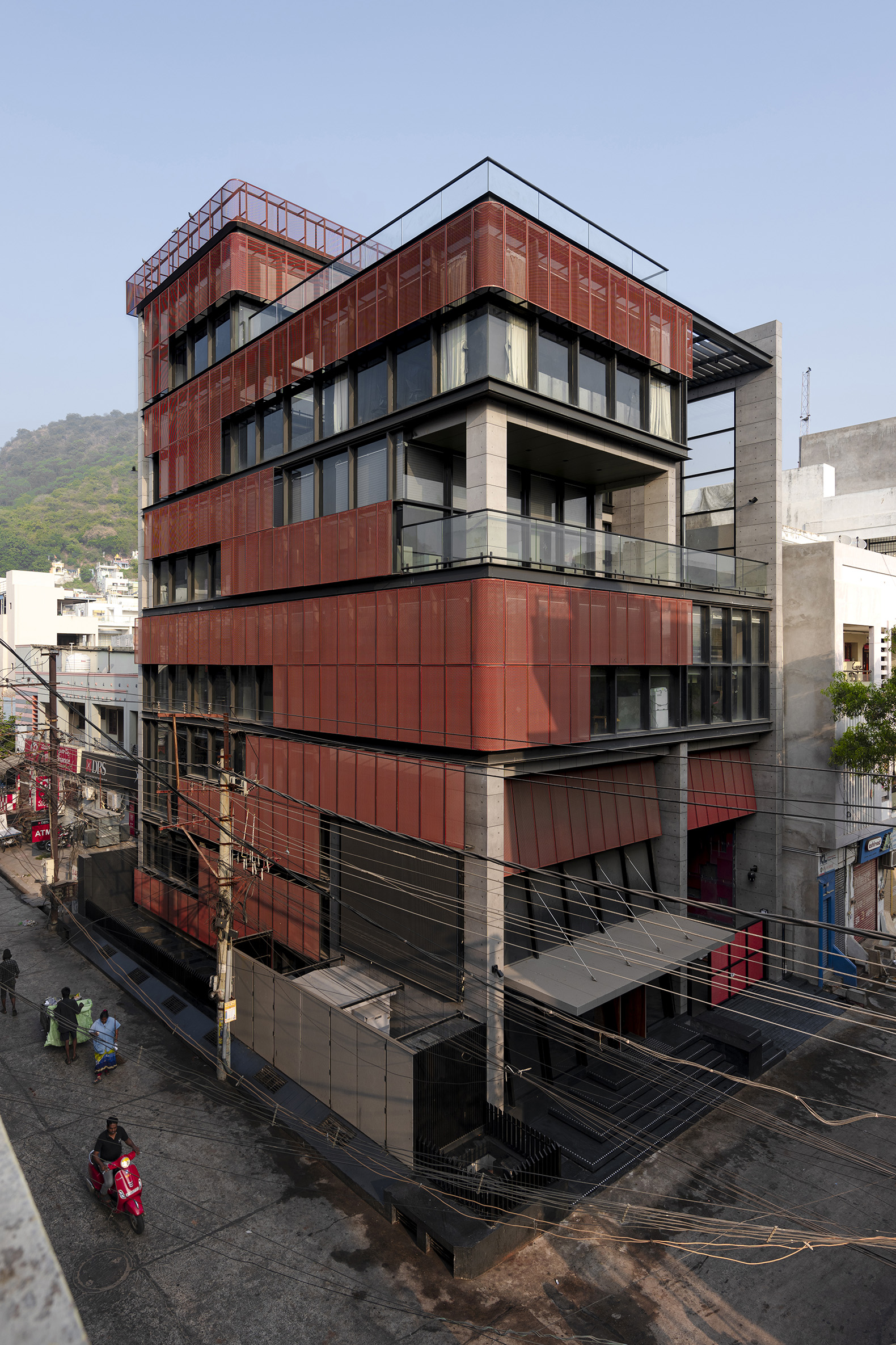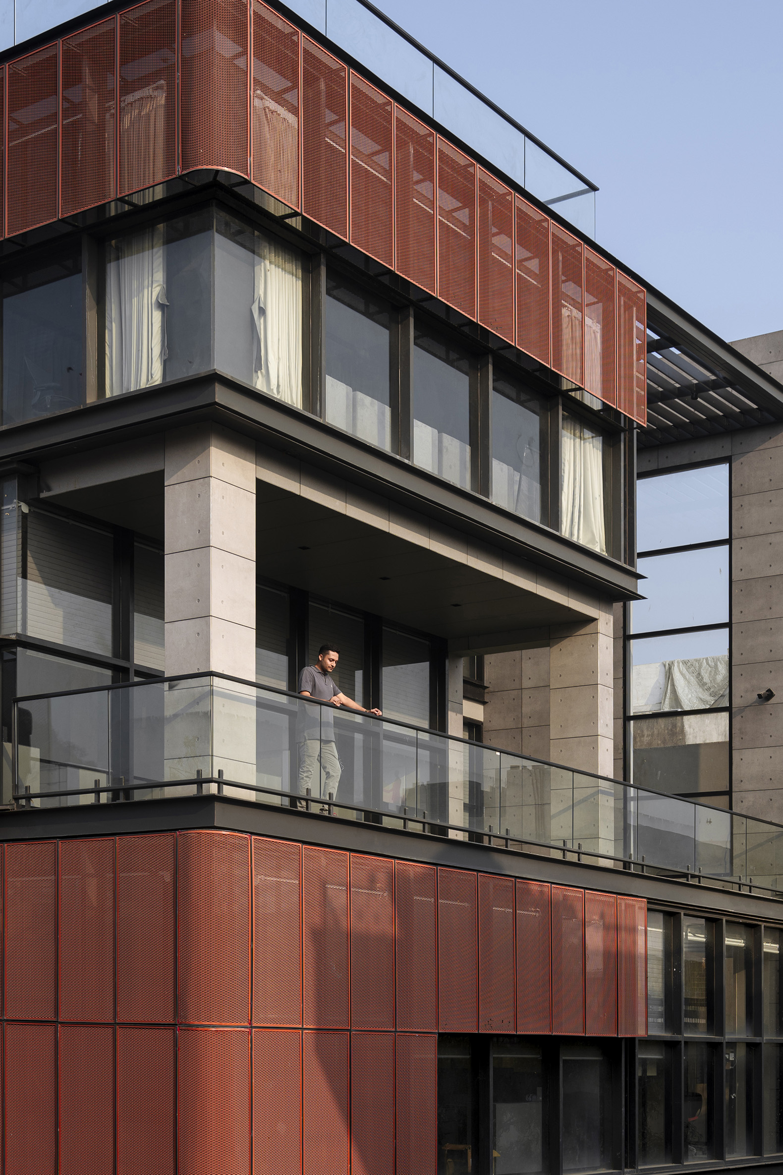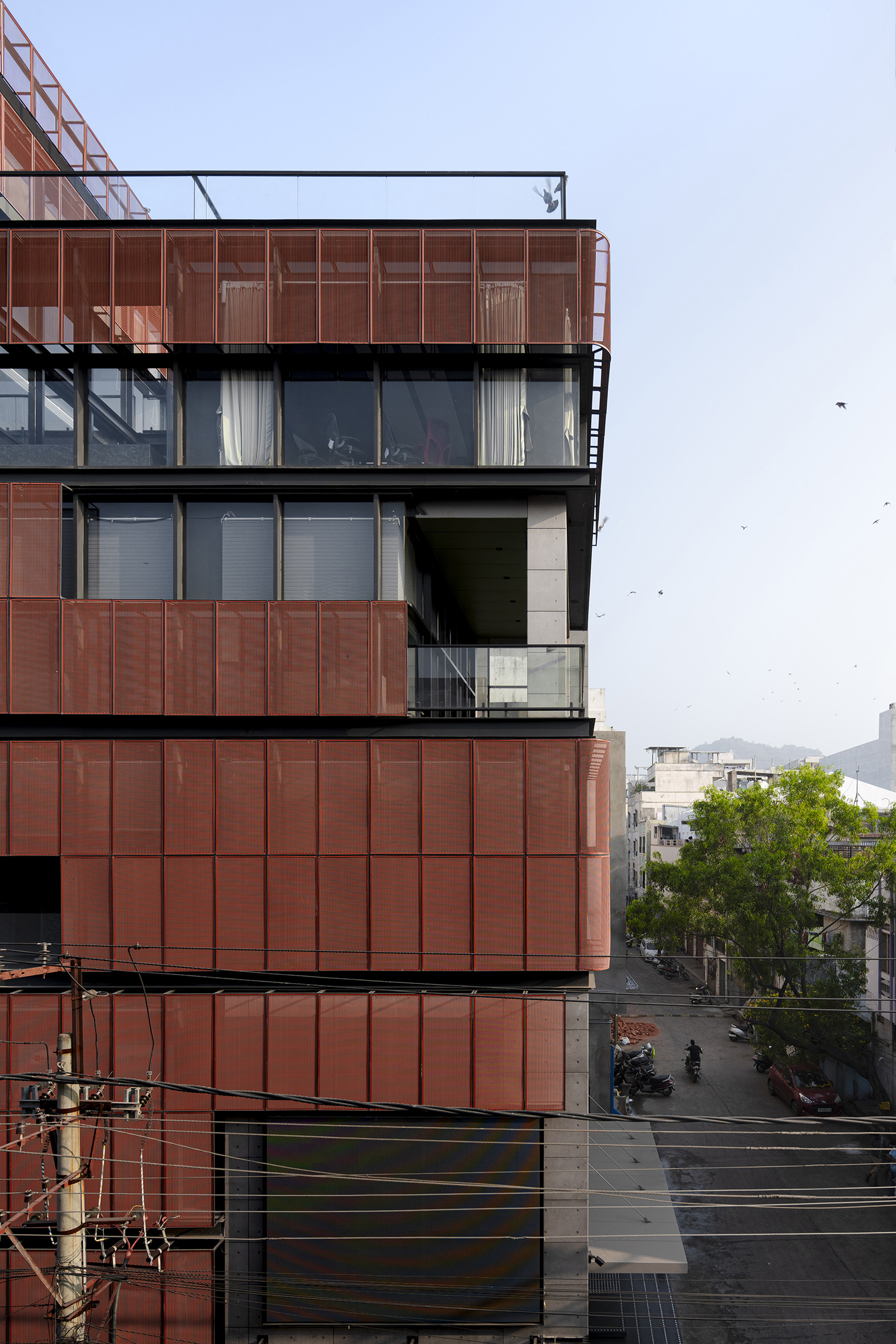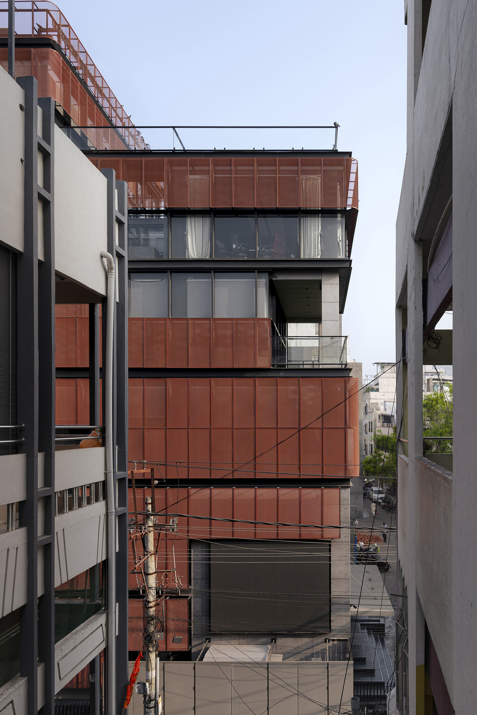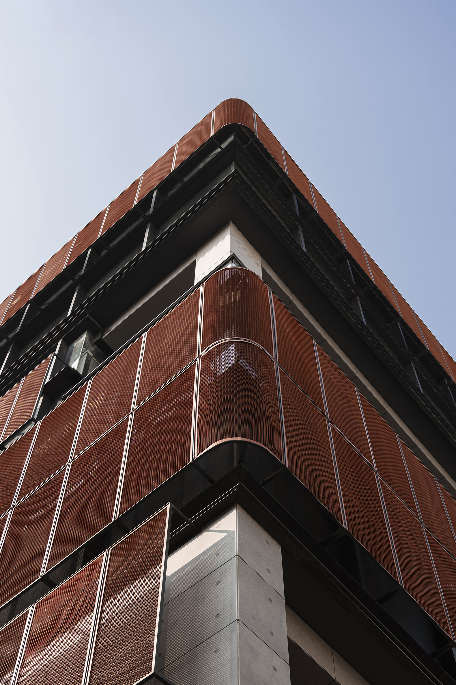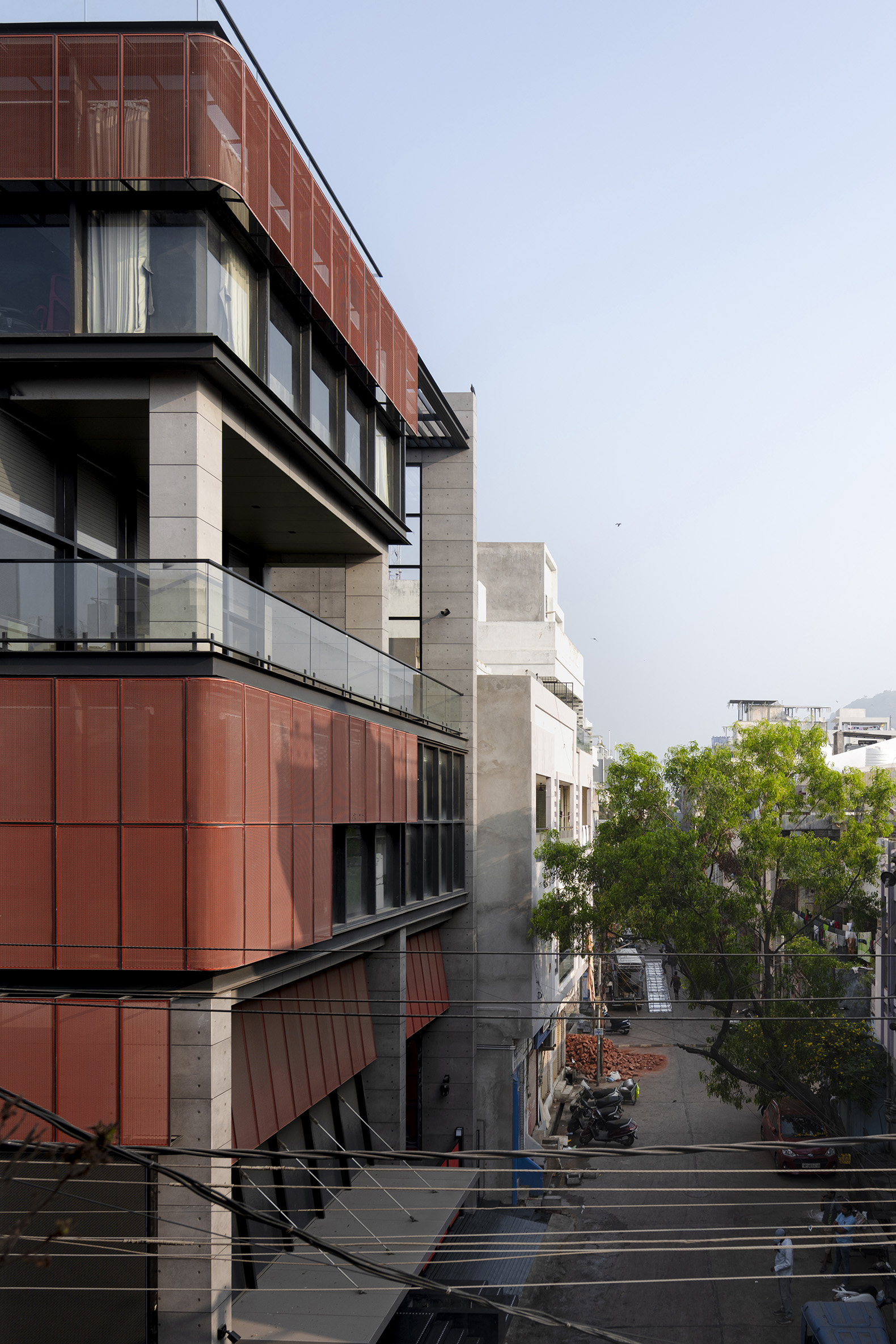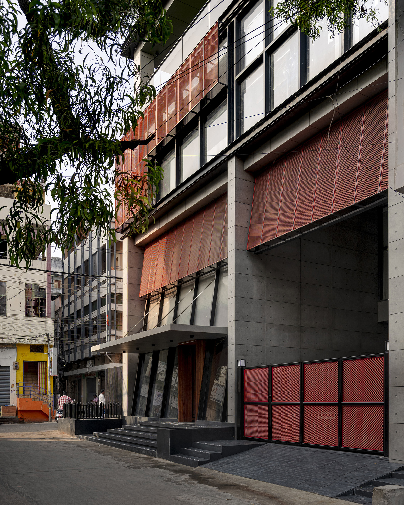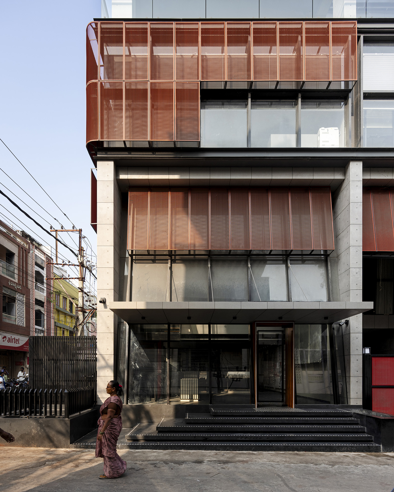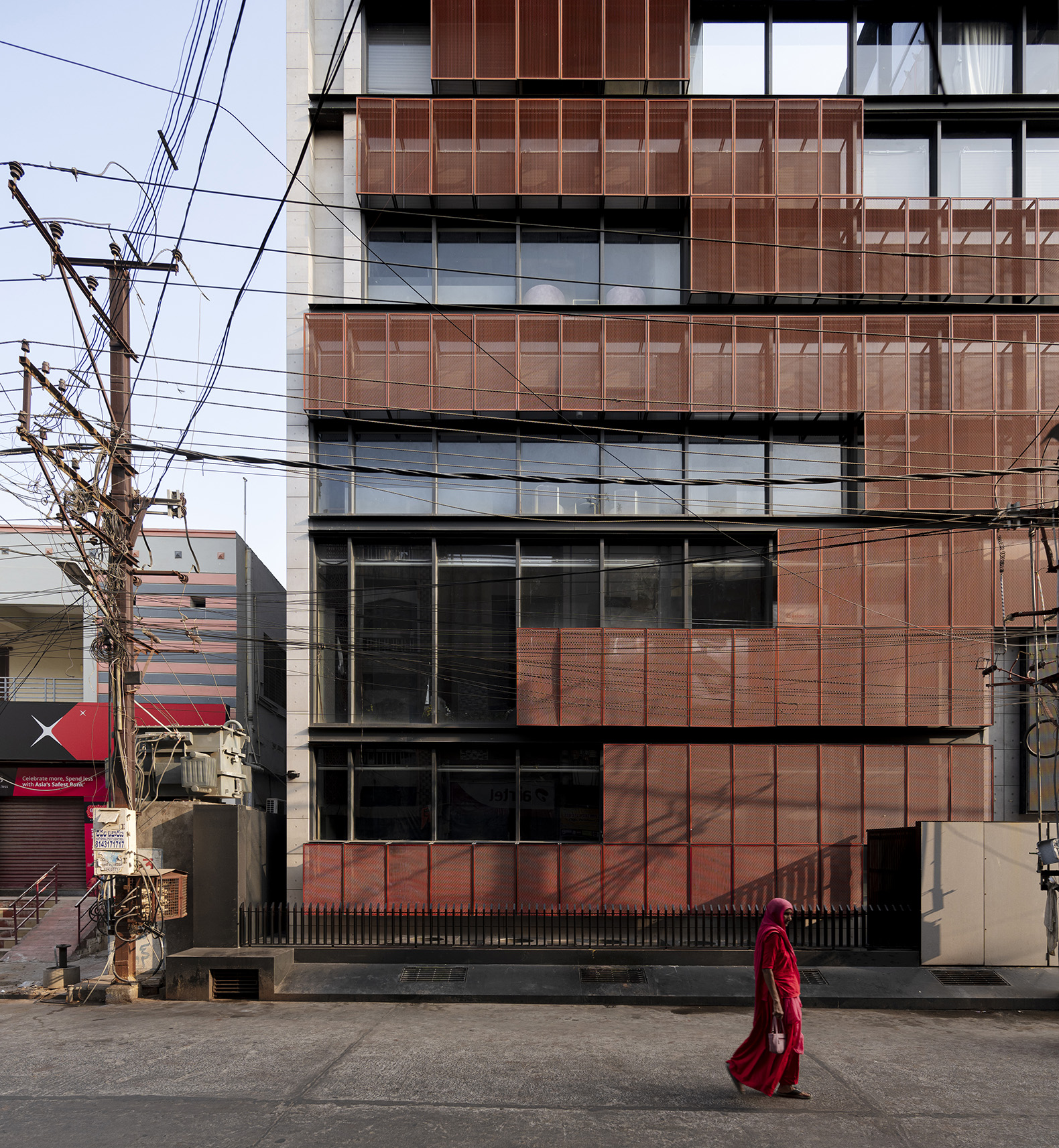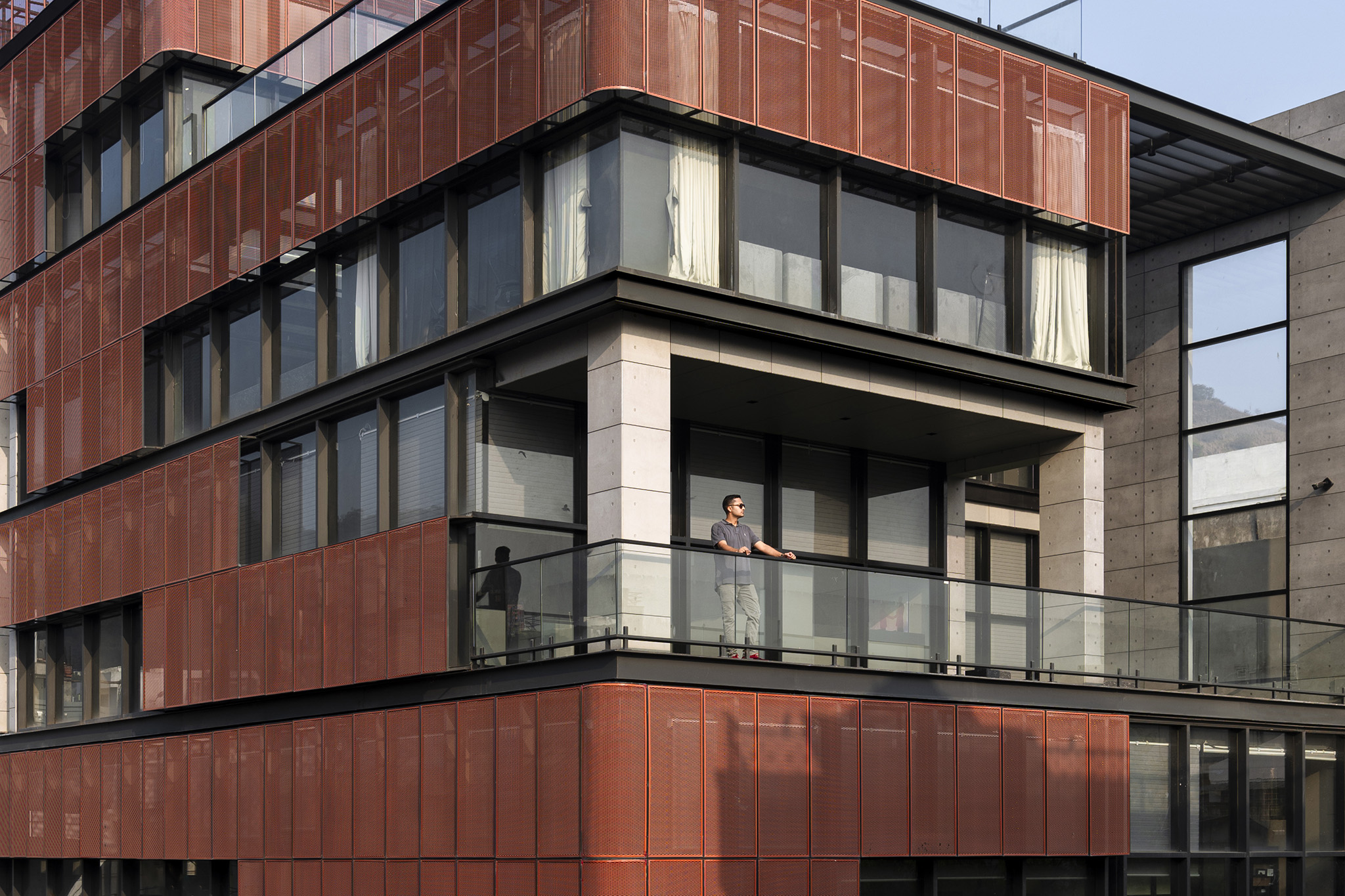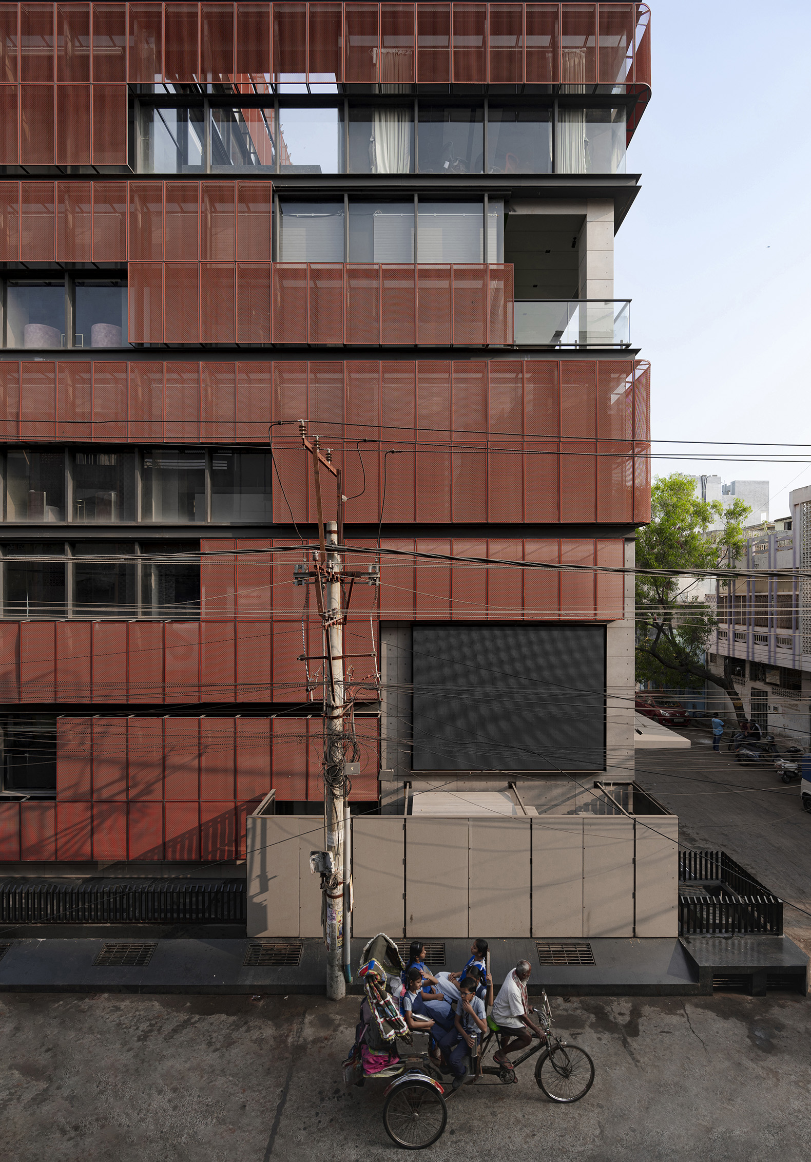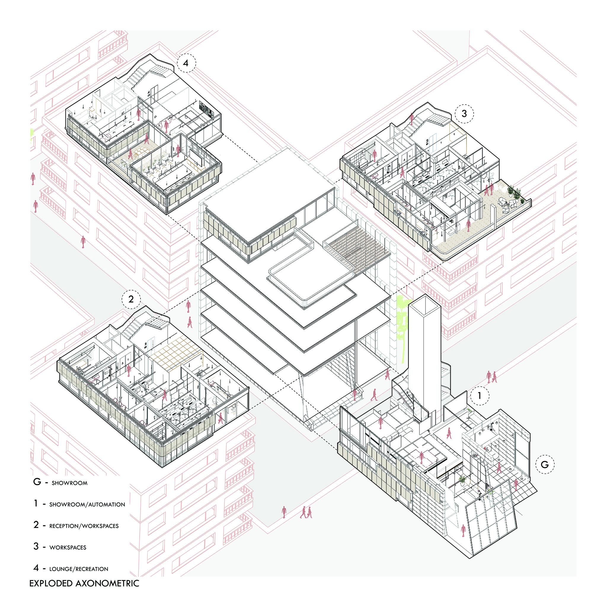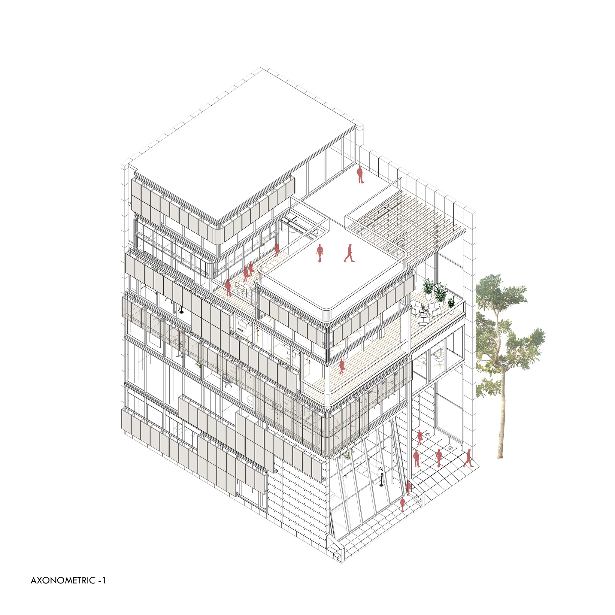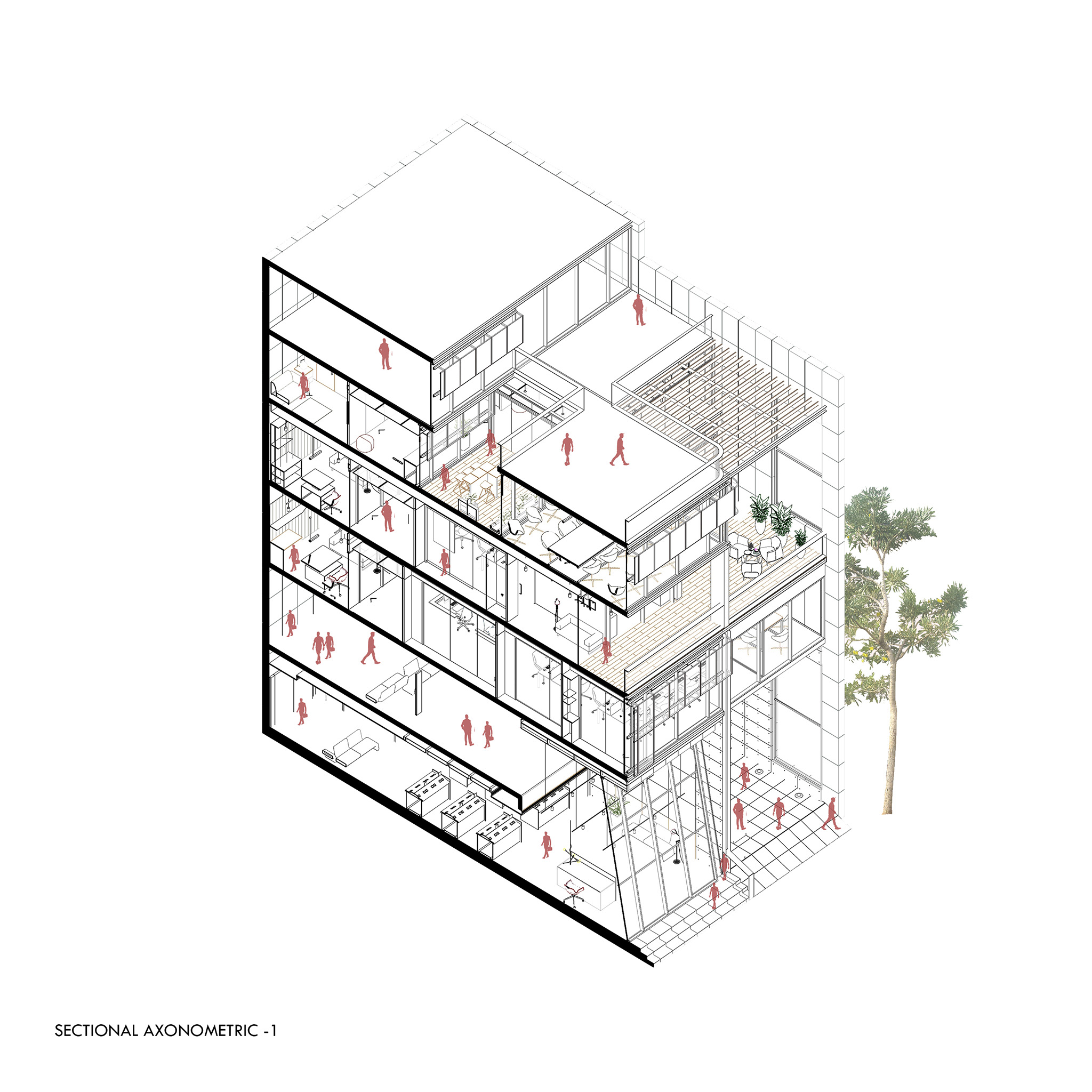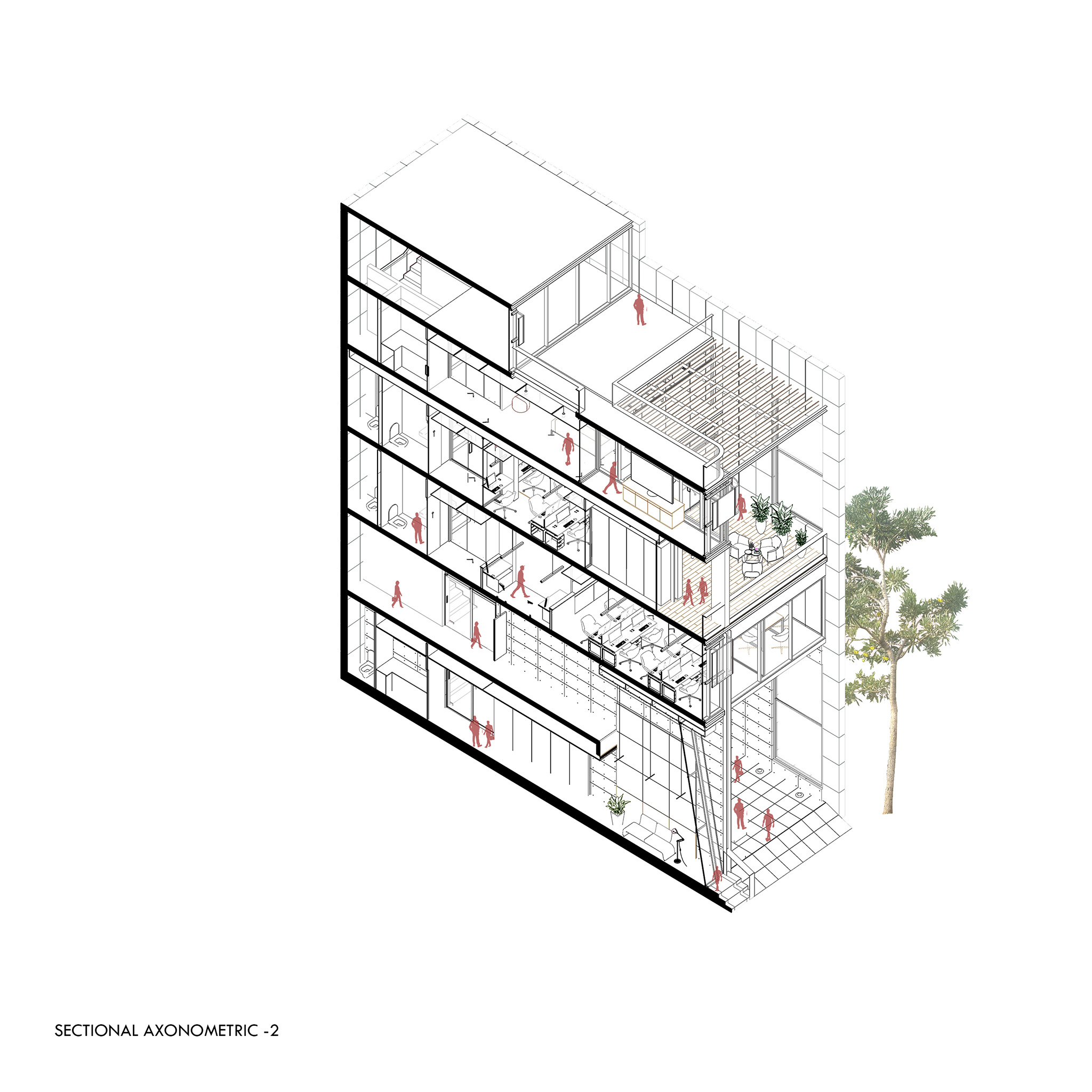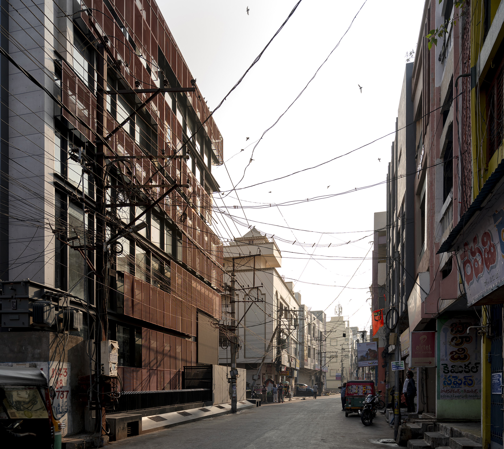
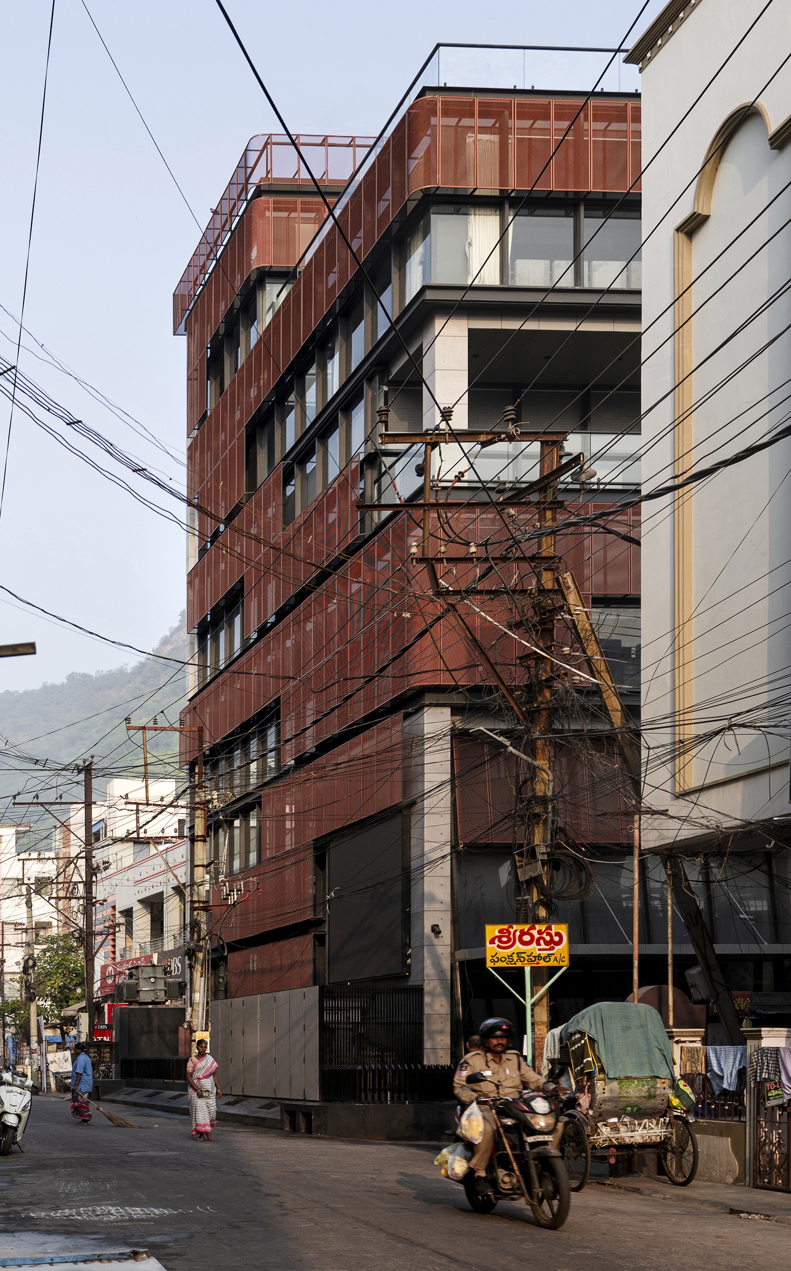
For "Screened Spaces," Studio UF+O proposes a unique visual identity through double-height volumes and interior courtyards. The experience center is located on the ground and first floors, and the workspaces on the upper floors, allowing for harmonious integration with the street and following the principles of Vastu Shastra, where the lightest and most open areas face northeast, and the heaviest volumes are concentrated towards the southwest.
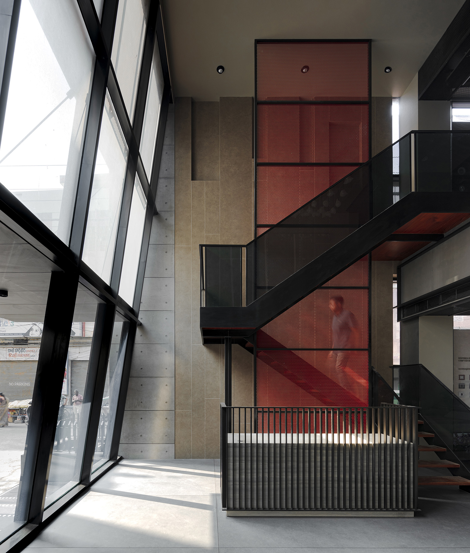
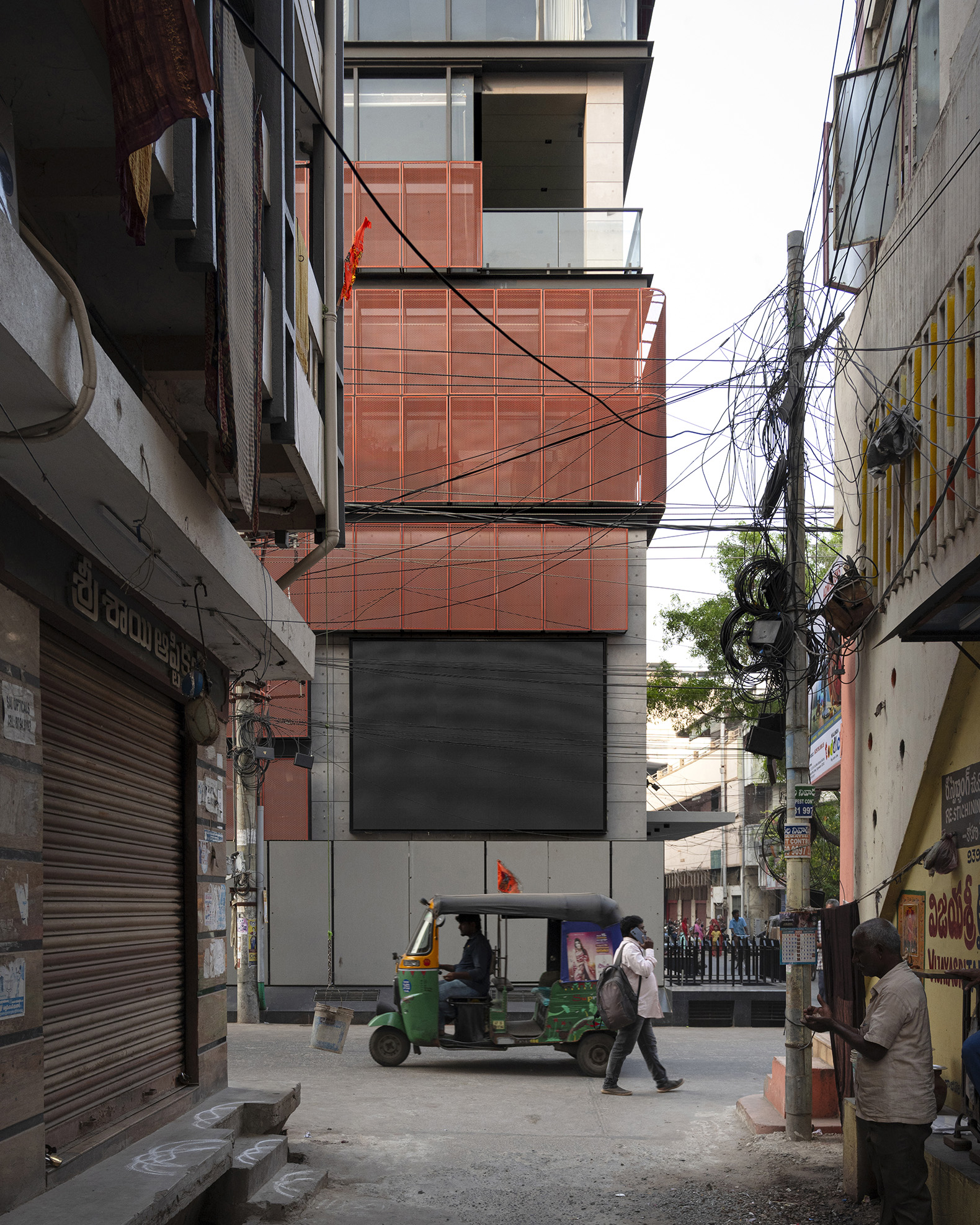
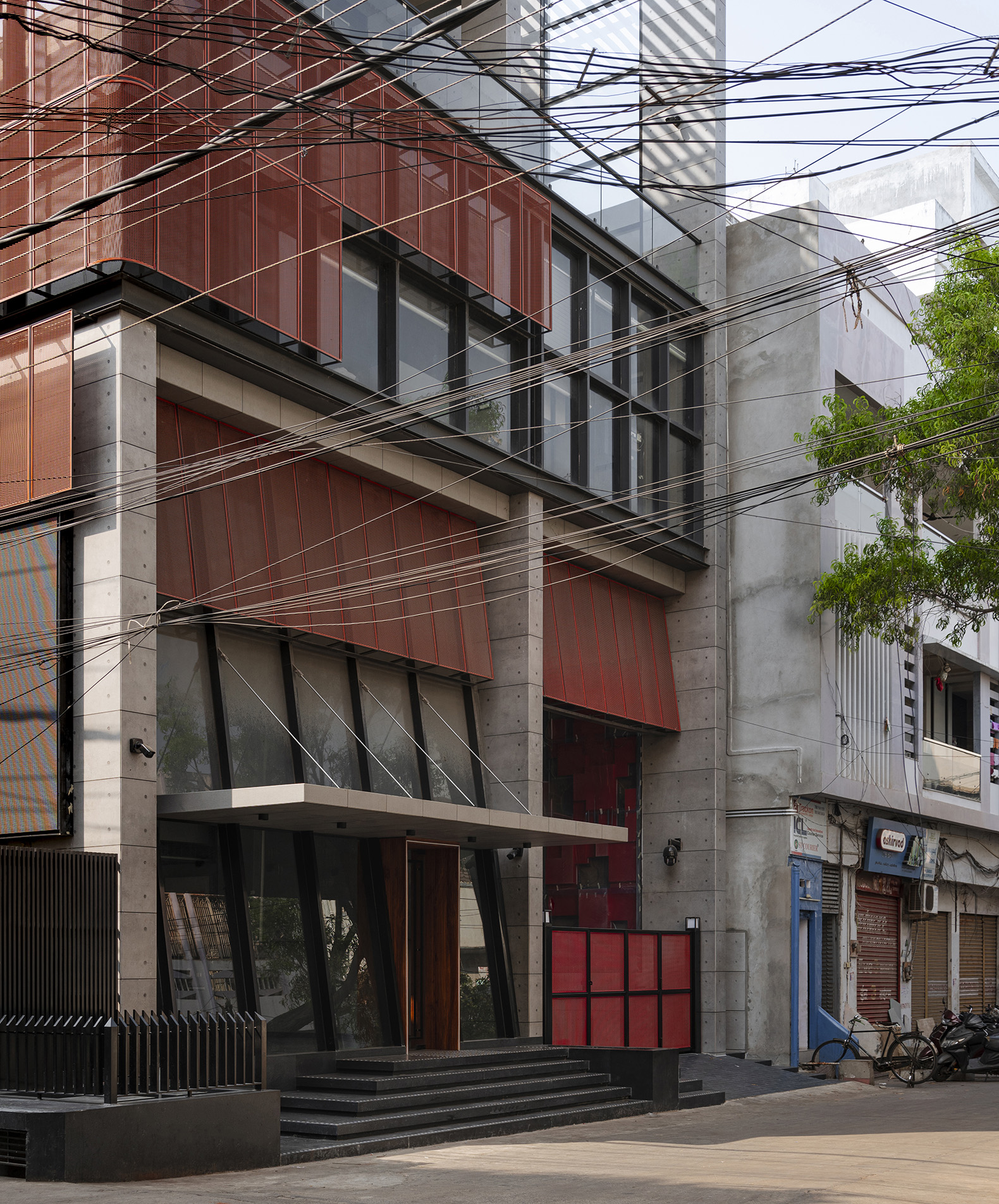
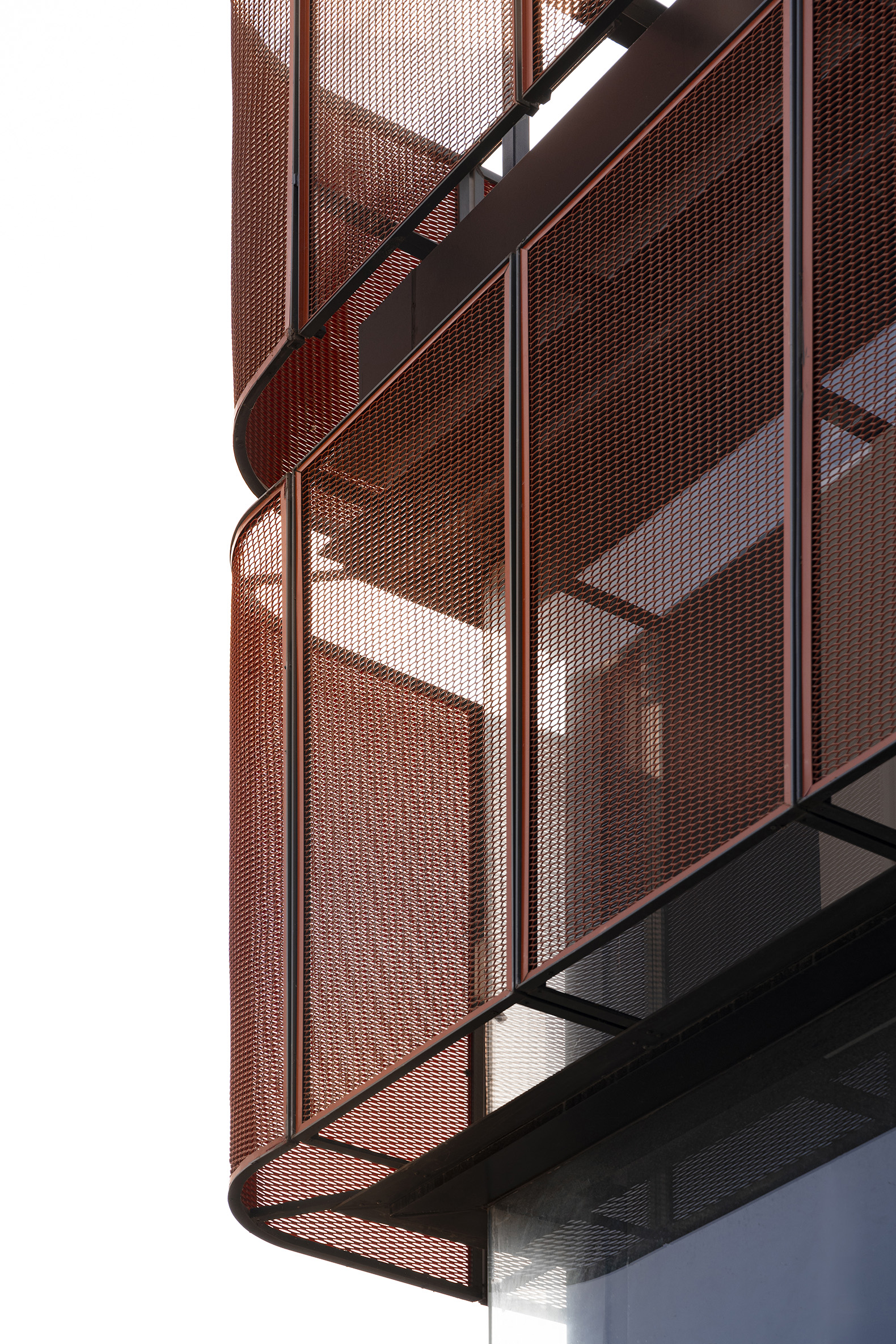
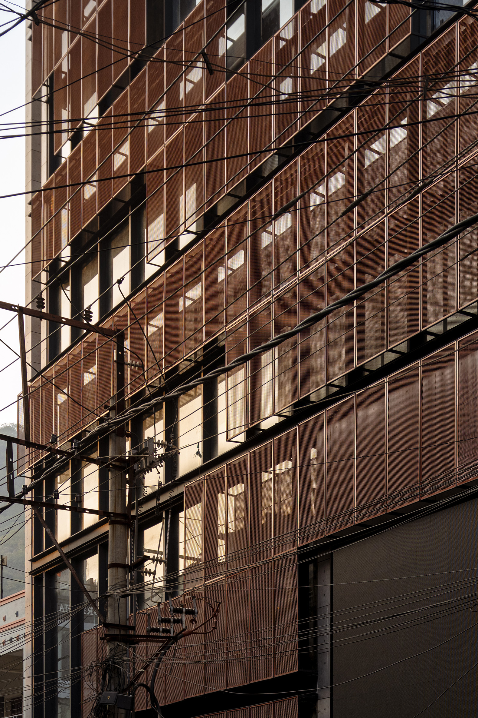
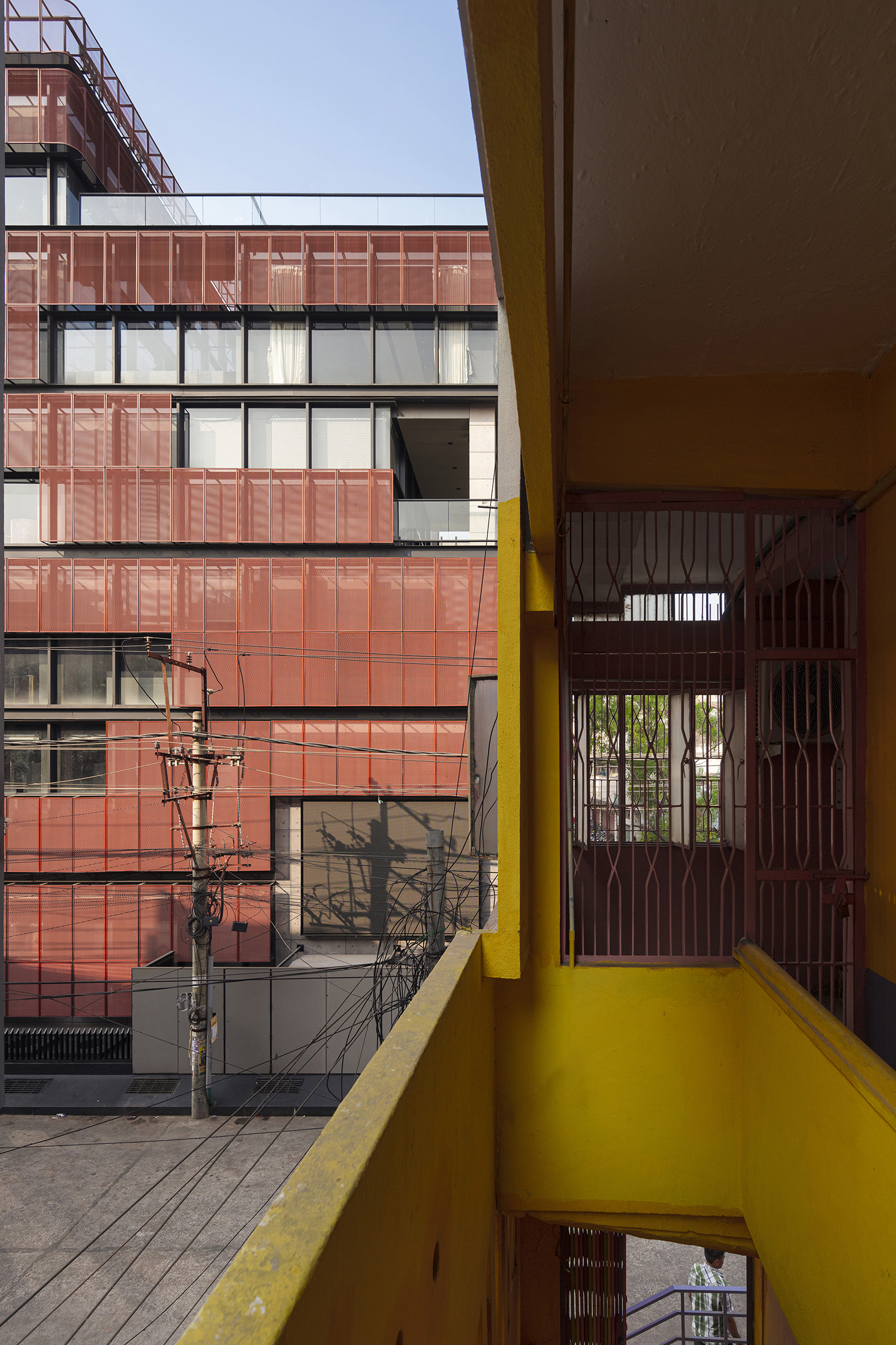
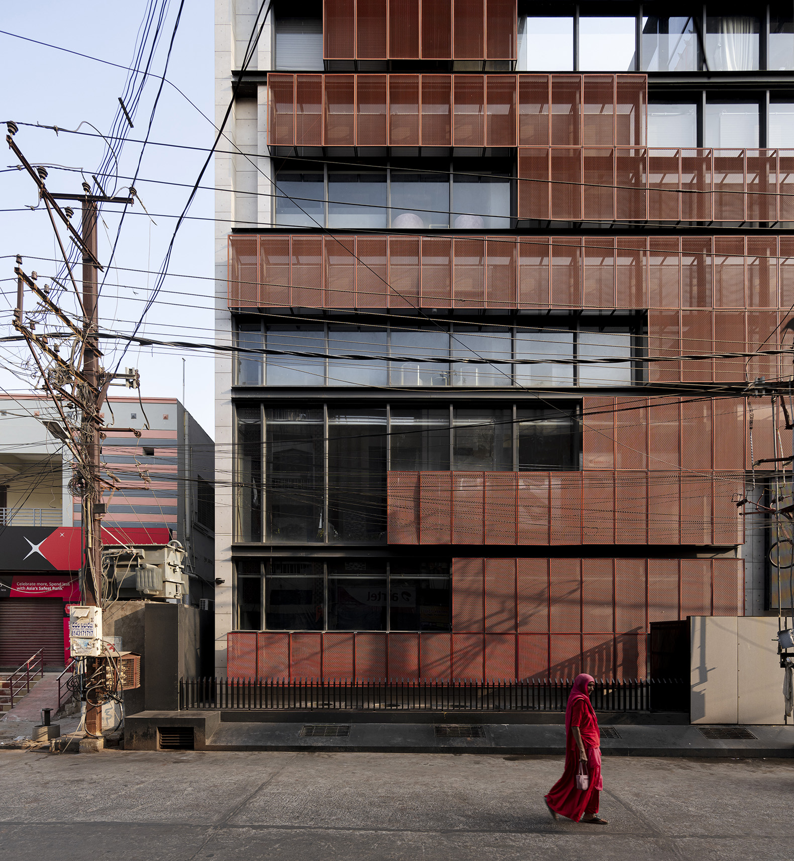
On the ground floor, a seven-meter-high inclined glazed façade opens the experience center to the public. On the longest façade, an opaque wall conceals the existing infrastructure, providing privacy rather than exposure. On the upper floors, a double-skin façade reduces heat gain without compromising privacy. This latticework, calibrated to the building's scale, is panelled and organised into a two-level system on each floor. The palette of red, grey, and black, along with the use of metal elements and modular systems, shaped the building's corporate identity.
"Screened Spaces" by Studio UF+O. Photograph by Vivek Eadara.
Project description by Studio UF+O
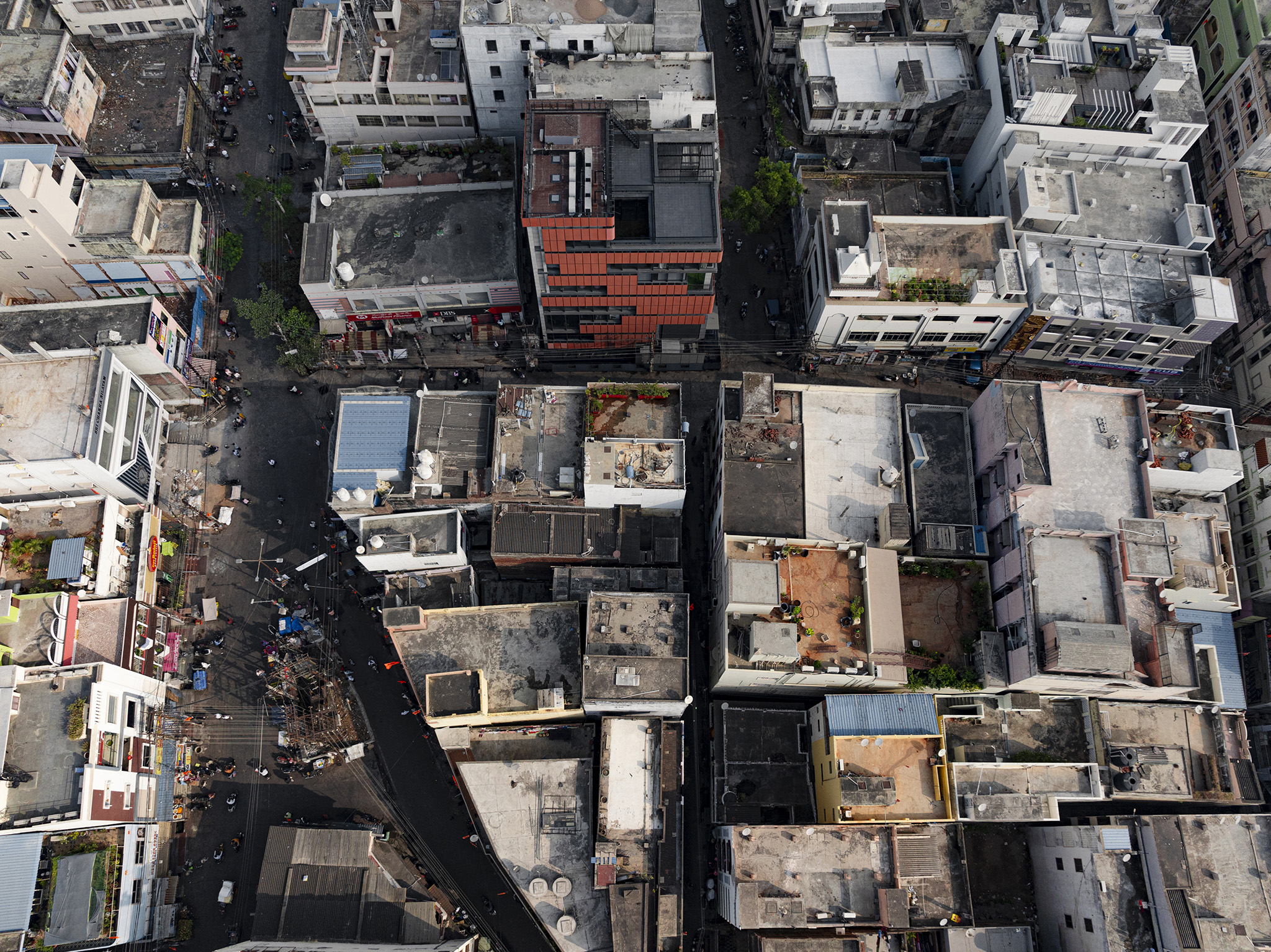
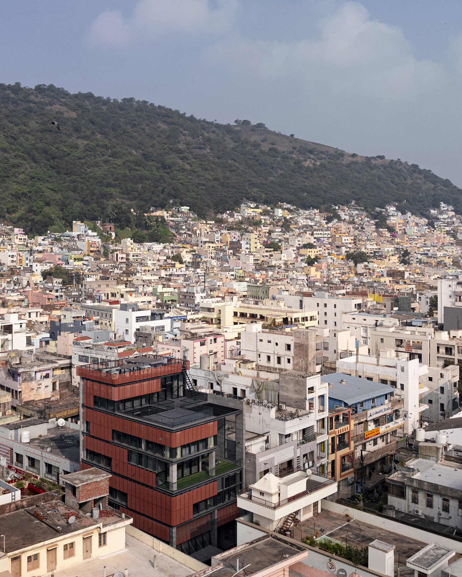
"Screened Space" is the headquarters and experience centre of an electrical switches company, located within the densely packed historic core of Vijayawada in Andhra Pradesh. It is conceived as an architectural response to its complex urban condition where streets are narrow, services are exposed, and buildings line tightly with little to no space between them. Within this setting, the project establishes a distinct presence by negotiating visibility, climate control and privacy.
The building occupies a corner plot within the market area, which exposes it to movement and views from two busy streets. This dual exposure means the building needed to be legible within the visually charged context. The project addresses this exposure by breaking through its built mass with double-height volumes and courtyard spaces. With the longer edge of the building being in the direct line of sight from the adjacent street, the design required a unique visual identity for the office block.
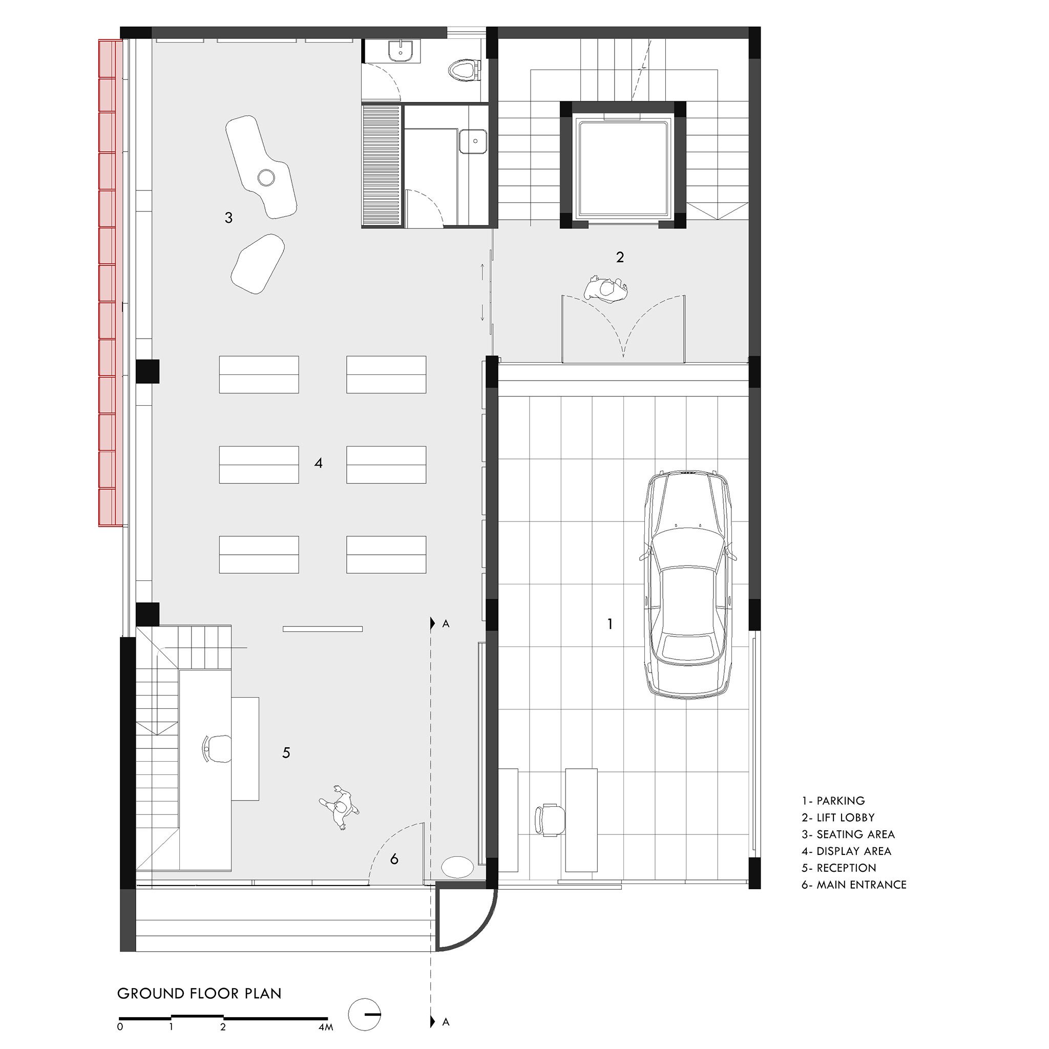
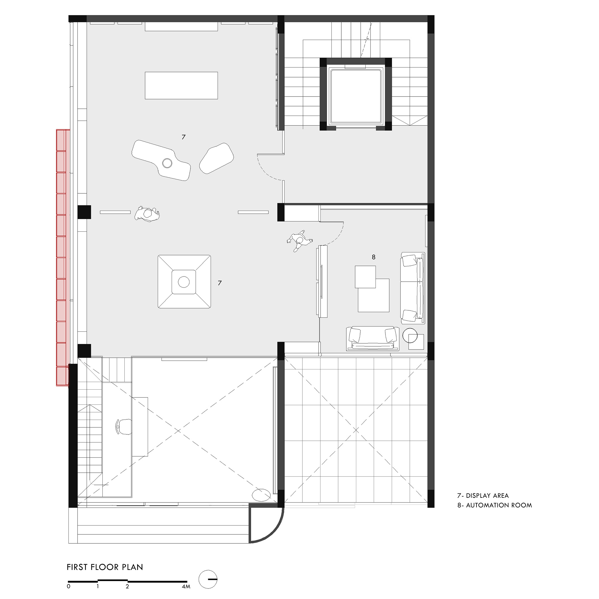
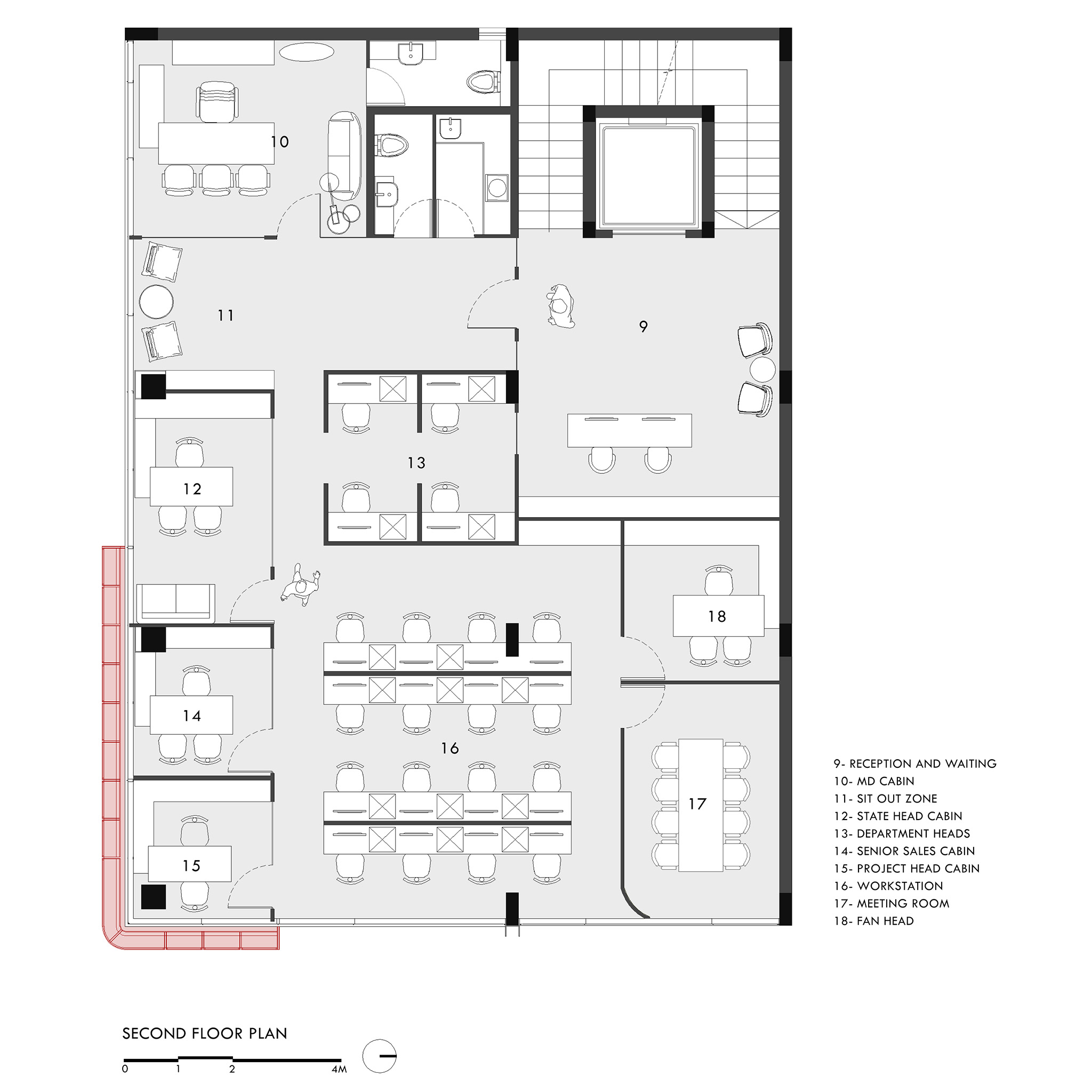
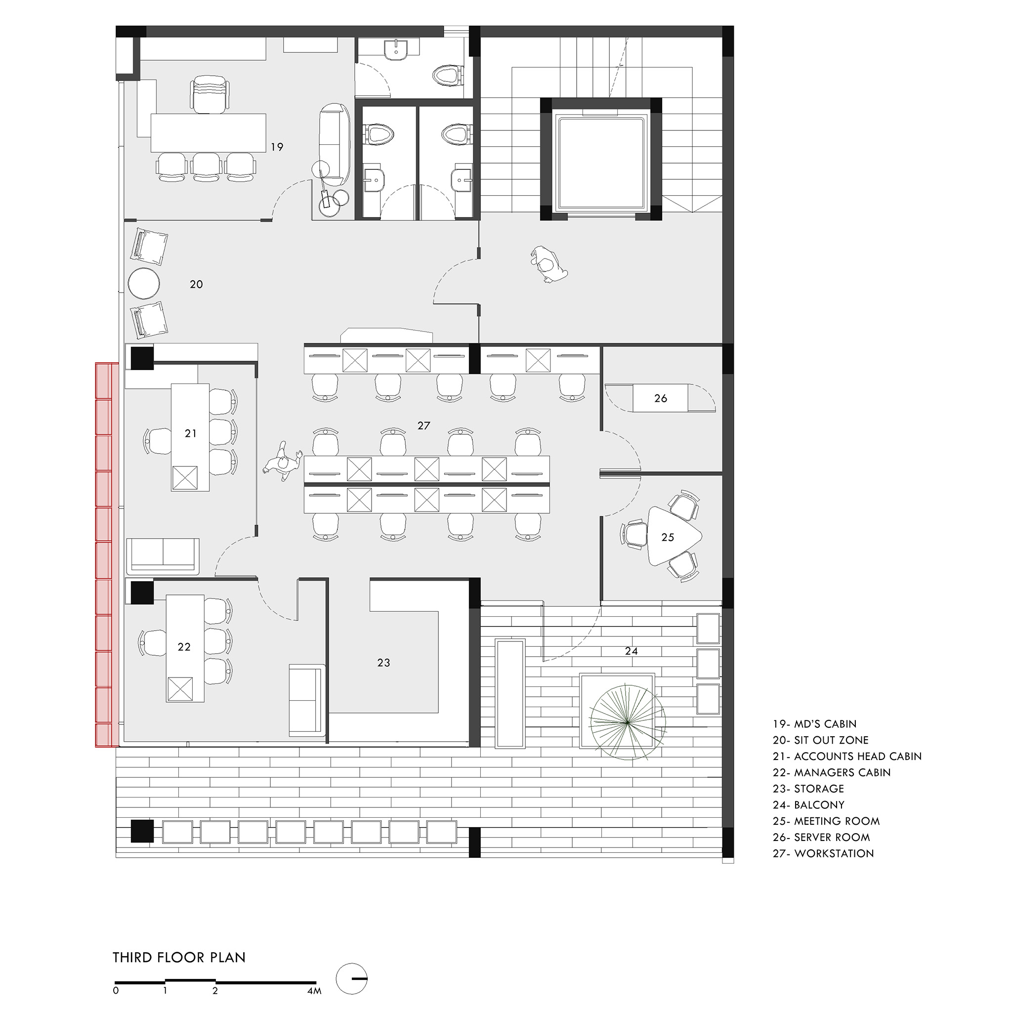
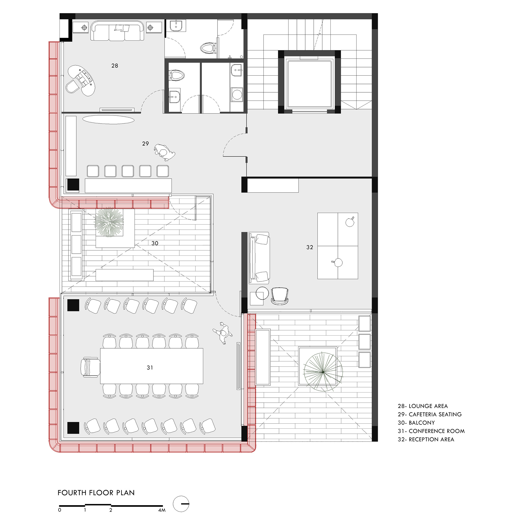
Spatially, the building is organised with the experience centre occupying the ground and first floor, while workspaces are located on the upper levels. This layout allows the project to address the street edge with openness while maintaining controlled environments above. Courtyards and double-height spaces are introduced within the built mass to allow natural light to penetrate into the space and create semi-outdoor pockets that support informal interaction within the workplace. Their placements are informed by Vastu principles, with lighter and more open zones positioned towards the north east, while heavier built volumes are concentrated towards the South West.
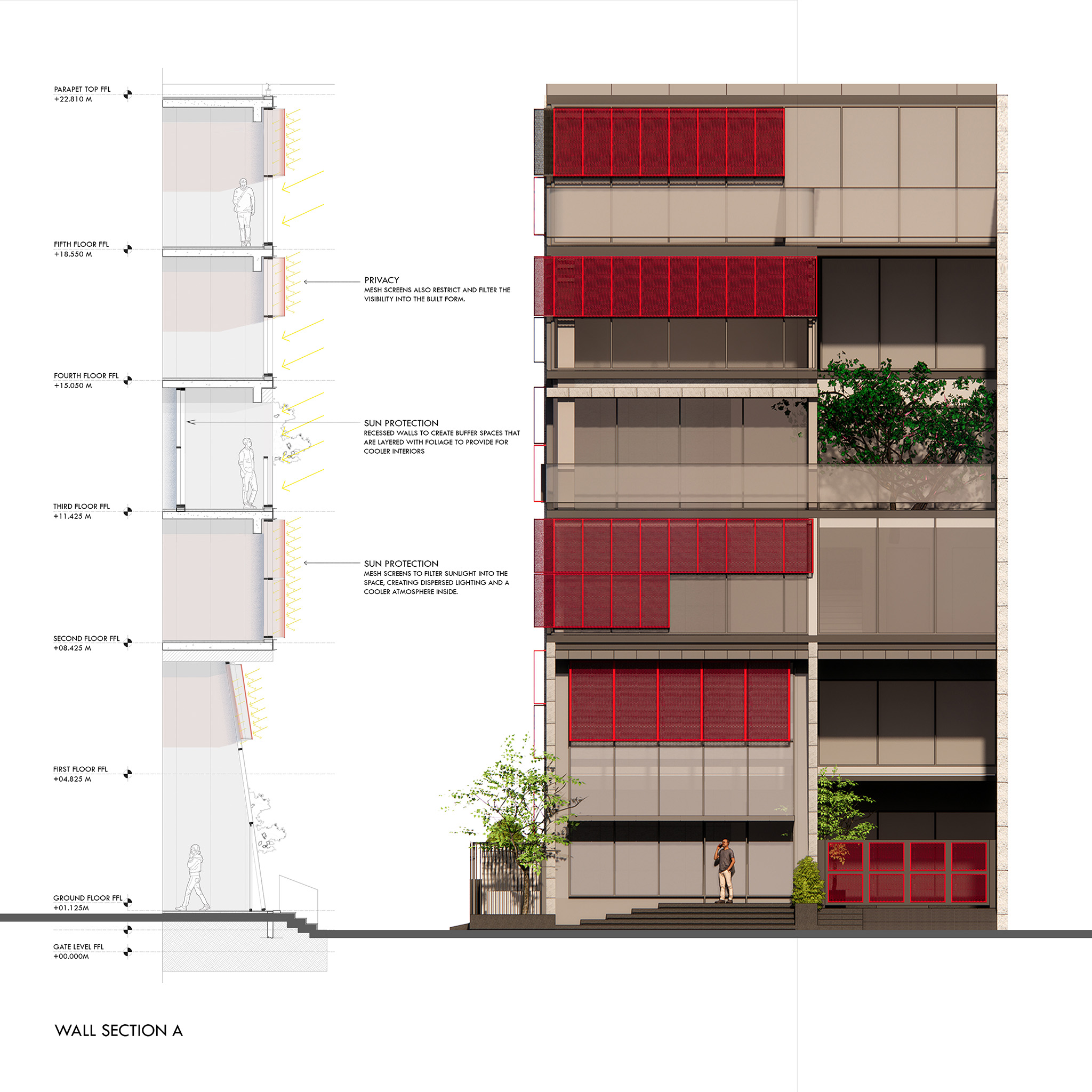
At the ground level, the building establishes a direct visual connection with the street through a twenty-four-foot slanting glazed frontage along its shorter length, allowing the experience centre to remain open to the public eye. On the longer facade, however, an opaque wall conceals existing infrastructure, responding to the direct line of sight from the adjoining street with an element of privacy instead of exposure.
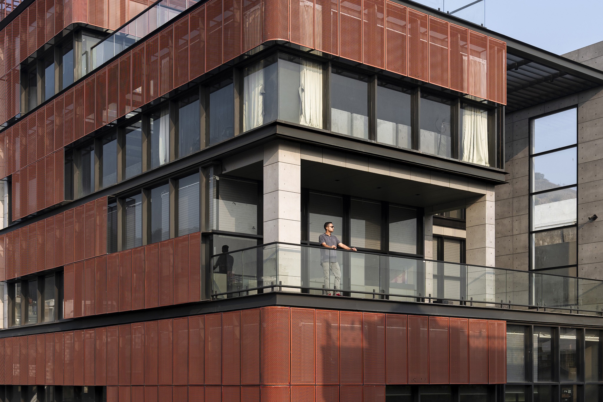
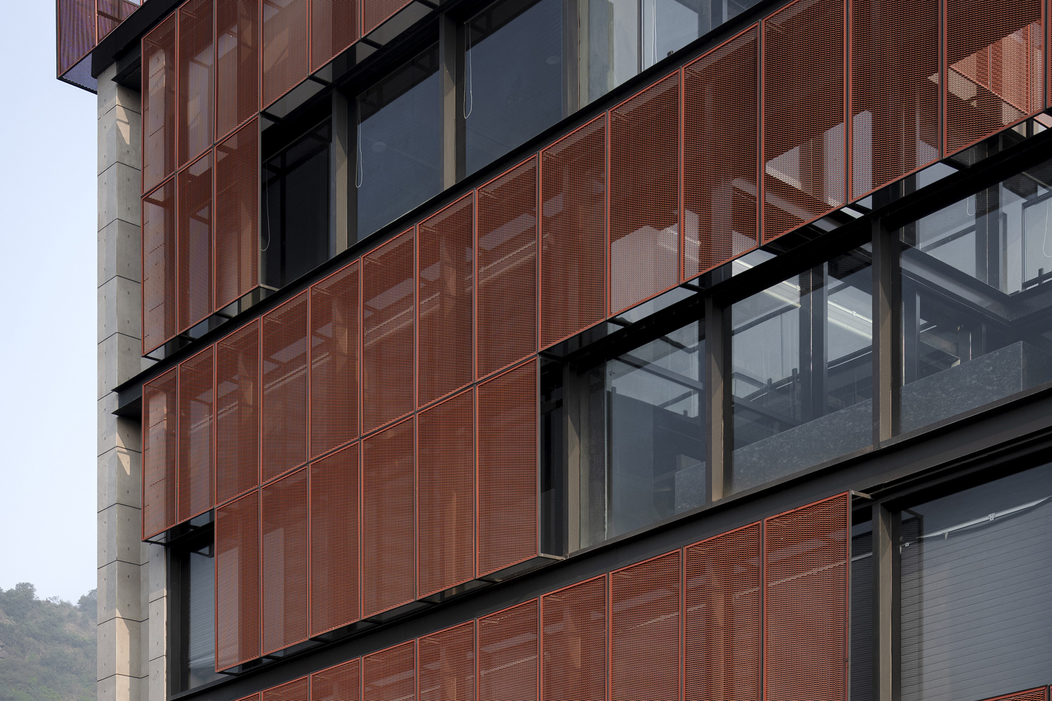
On the upper floors, the building envelope responds to its orientation and use. With the majority of workspaces receiving direct south sunlight, a custom-designed-double-skin facade was created to reduce heat gain while maintaining privacy.
The articulation of the screen has been calibrated to the scale of the building. The mesh is panelised and organised in a two-tier system across each level. This reduces material wastage and allows the building to retain a sense of lightness, reading as a layered veil rather than a singular monolithic surface. A consistent air gap is maintained between the glazing and the mesh layer to enhance thermal performance. The distribution of the mesh is guided by internal planning requirements. Areas with greater solar exposure have denser screening, while others remain more open. Some parts are left unscreened to maintain direct visual connections between inside and outside without affecting environmental performance.
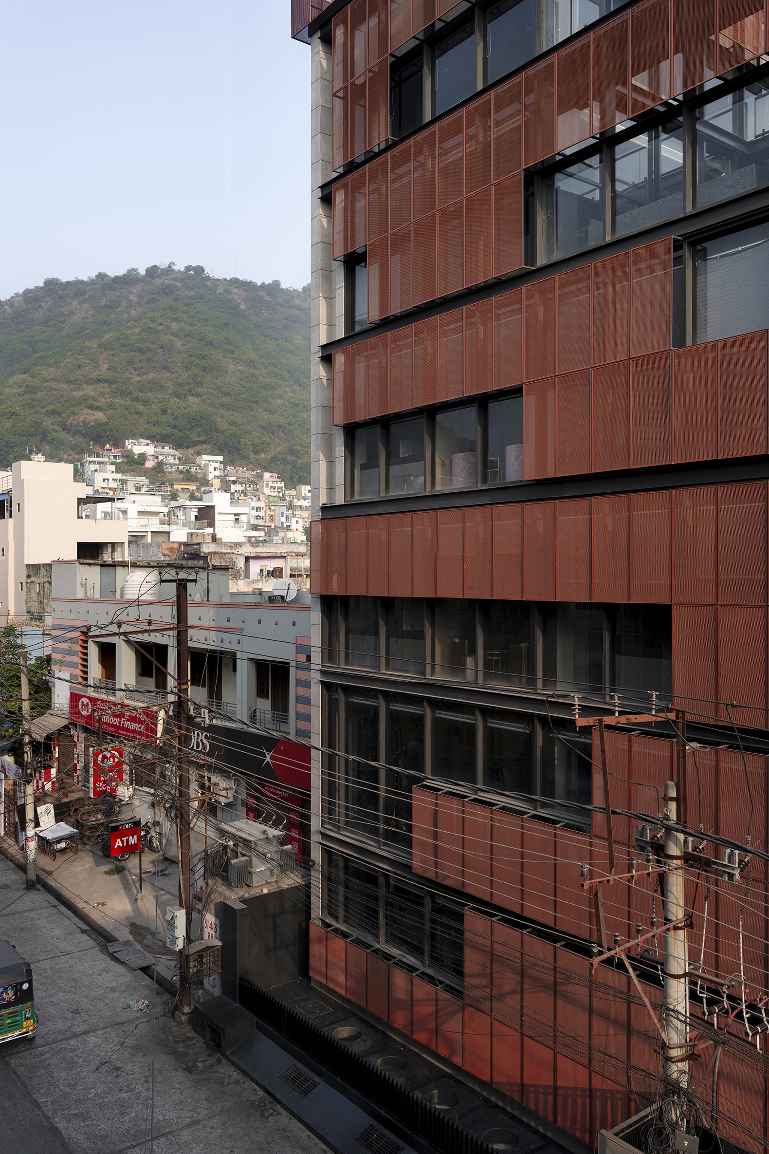
In the absence of a specialized facade consultant, the joinery details were resolved in close collaboration with local window vendors by creating multiple mock-ups on the site. A special joinery detail was also developed to mount the mesh panels onto the mullions of the structural glazing system, allowing flexibility in placement across the façade. The proportions of the aluminium members were then carefully calibrated through iterative testing to achieve the required structural stability without increasing visual thickness.
Material selection across the project is driven by durability, maintenance and context. A restrained palette of glass, aluminium and tiled surfaces is employed to ensure longevity within a dusty urban environment where upkeep can be challenging. Painted finishes are minimised in favour of anodised or powder-coated metal, while tiled surfaces replace more delicate materials to reduce wear over time.
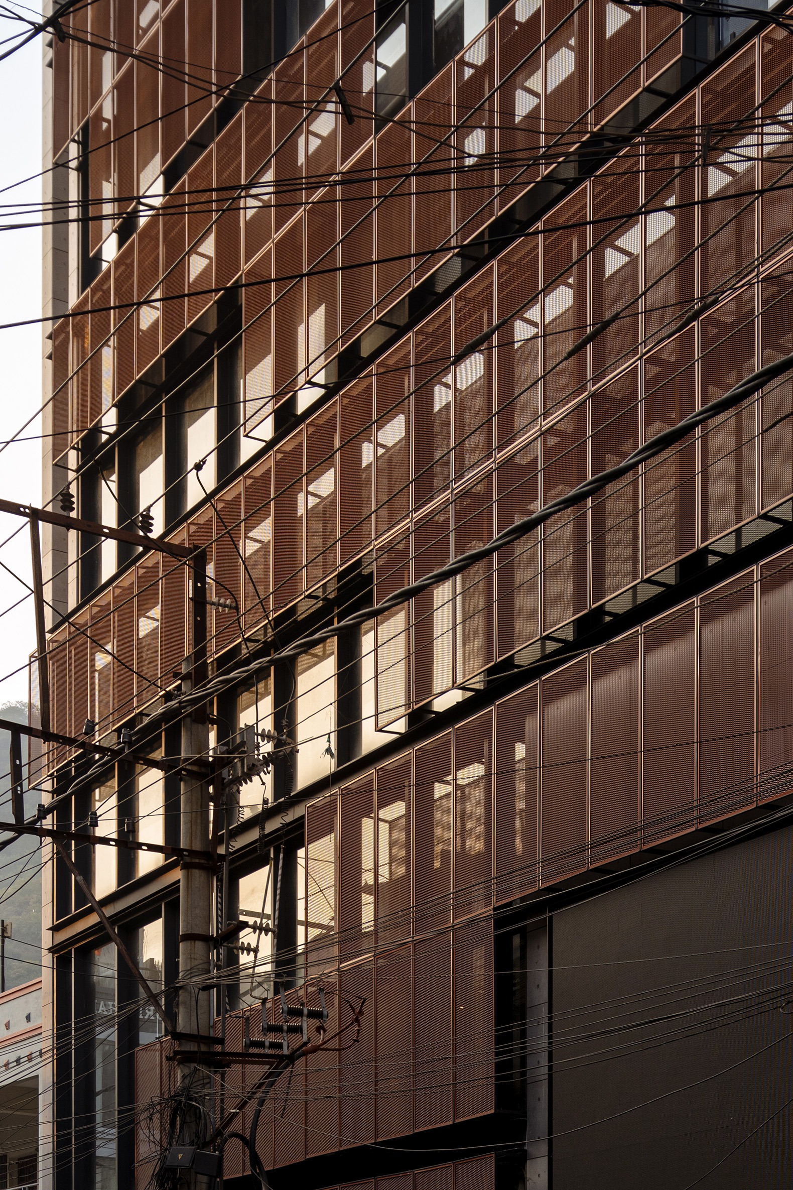
Beyond the architecture itself, the project extends into the development of a broader visual language for the company. The palette of red, grey and black, along with the use of metal elements and modular systems, informed a larger corporate identity that could be replicated across future offices and showrooms. Interior elements such as workstations, partitions and ceiling systems adopt this language, allowing the project to operate as a prototype for future expansions.
What defines "Screened Space" is not a singular formal move, but the way multiple constraints are resolved together. From initial massing to facade treatment and material selection, every design decision is guided by the need to reconcile visibility, climate, and function with the complex urban condition, so that the building stands out in its context through a unique system of layering and screening.