A great example of a brilliant recovery, in the face of the always demagogic speeches against the buildings of modernity, as in London with the imminent demolition of the apartments of Robin Hood Gardens, or the demagogic explanations of the owner of the Casa Guzman, or some responsible ones justifying the Demolishing previous, arguing that the buildings that resist better are those that can be retrofitted.
This project is an outstanding example, for many reasons, among others: for good effort means by citizen collective, (a collective that is committed to save the building from the knockdown-ball) by what it supposes of support to the processes of rehabilitation, and by which as means review on Modernity.
Description of project by NL Architects and XVW architectuur
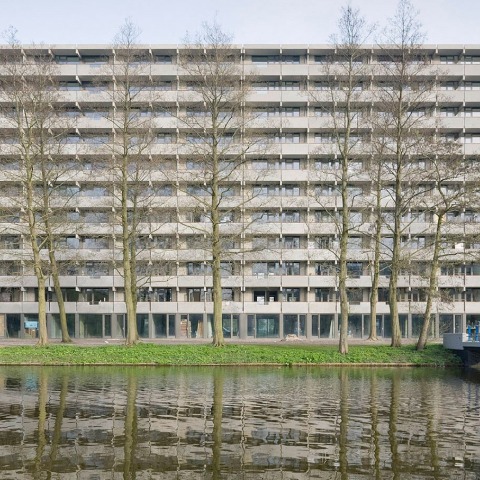
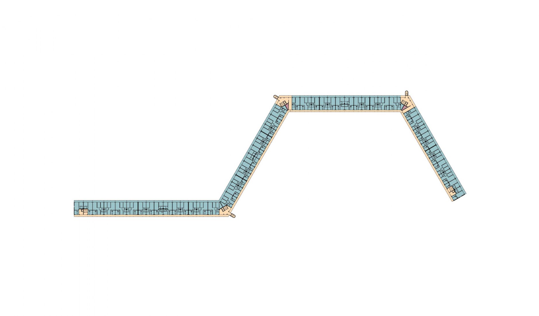
Kleiburg is located in the Bijlmermeer, a CIAM inspired residential expansion of Amsterdam.
A renewal operation started mid nineties. Many of the characteristic honeycomb slabs were replaced by suburban substance, by ‘normality’.
Kleiburg was the last building in the area still in its original state; in a way it is the “last man standing in the war on modernism”.
The idea is to renovate the main structure -elevators, galleries, installations- but to leave the apartments unfinished and unfurnished: no kitchen, no shower, no heating, no rooms. This minimizes the initial investments and as such creates a new business model for housing in the Netherlands.
Most attempts to renovate residential slabs in the Bijlmer had focused on differentiation. The objective: to get rid of the uniformity, to ‘humanize’ the architecture. By many, repetition was perceived as evil.
But after three decades of individualization, fragmentation, atomization it seems an attractive idea to actually strengthen unity: Revamp the Whole!
It is time to embrace what is already there, to reveal and emphasize the intrinsic beauty, to Sublimize!
In the eighties three shafts had been added including extra elevators: they looked ‘original’ but they introduced disruptive verticality. It turned out that these concrete additions could be removed: the elevators could actually be placed inside the cores, the brutal beauty of the horizontal balusters could be restored.
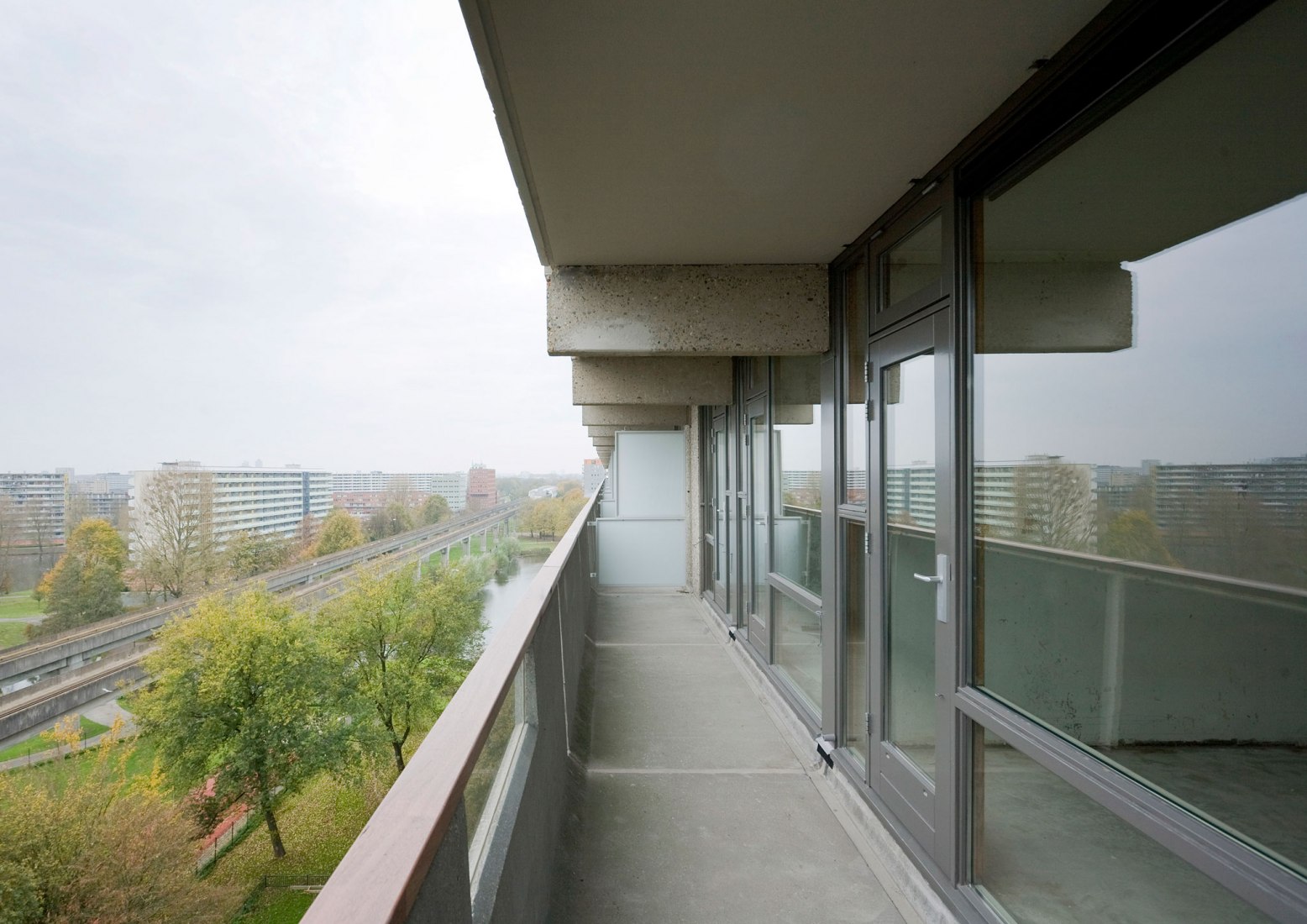
On the galleries the division between inside and outside was rather defensive: closed, not very welcoming. The closed parts of the facade were replaced with double glass. By opening-up the facade the ‘interface’ becomes a personal carrier of the identity of the inhabitants, even with curtains closed.
Sandblasting the painted balusters revealed the sensational softness of the pre-cast concrete: better than travertine!
Originally the storage spaces for all the units were located on ground level. The impenetrable storerooms created a ‘dead zone’ at the foot of the building. By positioning the storage on each floor we could free up the ground floor for inhabitation, activating it to create a social base and embedding the ‘beast’ in the park.
More generous, double height connections between both sides of the building were formed creating scenic relationships.
Gallery illumination has a tendency to be very dominant in the perception of apartment buildings with single loaded access. The intensity of the lamps that light up the front doors on the open-air corridors overrules the glow of the individual units. The warm ‘bernstein’ radiance of the apartments is ‘obscured’ by a screen of cold lights. But what if the gallery lights worked with energy saving motion detectors? The individual units now define the appearance. Every passer-by a shooting star!
