The Spanish artist collective Boa Mistura just finished the three artworks on the construction fence of The Bauhaus Archives, one of the last projects developed by Walter Gropius.

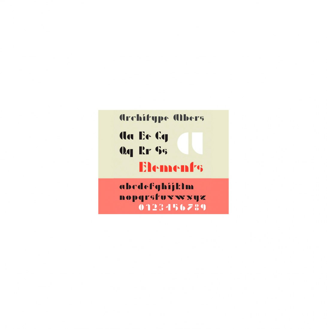
The typography which Boa Mistura chose for the second part of their construction fence artwork is taken from a modular experimental alphabet by Josef Albers. It uses squares, circles, and triangles to generate a singular typography, offering Boa Mistura interesting possibilities when it comes to composing and overlapping.
The color scheme that Boa Mistura chose for the second part of their construction fence artwork is inspired by Gunta Stölzl. They pick her work because of its balance between harmony and contrast.

The design highlights every geometric shape through the use of color, while the geometric module matches the fence height for the new typography to perfectly adapt to it
 

Description of project by Boa Mistura

We’ve had the privilege of coming back to Berlin thanks to Bauhaus-Archiv to work at the perimetral fence surrounding the construction site of the extension of the current Walter Gropius' Bauhaus archive building.

This time, we've developed a new site-specific alphabet, based on the modular alphabet by Josef Albers.

STEP 1
Albers’ typography is made up of squares, circles, and triangles, meaningful shapes in the Bauhaus’ universe. That’s why we started by deconstructing the letterforms.

STEP 2
Based on the structure, we highlight every geometric shape through the use of color. Our starting point is a color palette by Gunta Stölzl, a skillful textile artist, which allowed us to skip the rule that establishes the yellow triangle, the red square, and the blue circle.

The next step responds to the typography adaptation according to the horizontal proportions of the fence.

STEP 3
We duplicate each character to have a visual reference of the two halves that compose the letterforms. We slightly overlap both parts to add new geometry and visual rhythm.

STEP 4
We keep the most recognizable part of the letter, discarding the ascender and descender heights of every character. We match the geometric module with the fence height for the new typography to perfectly adapt to it.

The proposed quote is by Hannes Meyer, the second director of the Bauhaus: “Bauen und Gestalten sind eins” - “Construction and design as one”.

Read more
Read less

More information

Label
Artists - Production
Text
+ + copy Created with Sketch.
- + copy Created with Sketch.
Label
Client
+ + copy Created with Sketch.
- + copy Created with Sketch.
Label
Dates
Text
2020.
+ + copy Created with Sketch.
- + copy Created with Sketch.
Label
Location
Text
Berlin, Germany.
+ + copy Created with Sketch.
- + copy Created with Sketch.
Label
Photography
+ + copy Created with Sketch.
- + copy Created with Sketch.

Boa Mistura. The work of Boa Mistura is all about the love of graffiti, colour and life. This group founded by 5 Spanish artists is, as the name says, a good mixture. Arkoh, Derko, Pahg, Purone and Rdick have developed their work in different fields, applying both a diversity of styles and the different views of each member. Boa Mistura represents a mixture of perspectives which complement, influence and mix themselves together in order to create something better. From graffiti and mural painting, to graphic design and illustration, Boa Mistrua want to give the world its colour back. 5 heads, 10 hands, just one heart.

Boa Mistura is a multidisciplinary group whose roots are in graffiti, currently directed by Javier Serrano, Pablo Ferreiro and Pablo Purón. The group works in various fields: from the latest trends in graffiti and street murals, to illustration, graphic design, studio painting and collaborations with interior designers and architects.

They have taken part in exhibitions in art galleries such as the Reina Sofía Museum and the Casa Encendida in Madrid, and the DA2 Museum in Salamanca. They have collaborated with foundations such as ONCE (Spanish national organisation for the blind), Oxfam and Antonio Gala, and given lectures at universities such as Madrid, Seville and Alcalá de Henares.

Boa Mistura has completed projects for brands such as Google, Microsoft, Sony Music and Adidas and in 2010 a Latin Grammy nomination for best cover design. The term “Boa Mistura”, from the Portuguese for “good mixture”, refers to the diversity of style and perspectives of each member. Love for graffiti, colour and life. Distinct visions which complement each other, influence each other, and always combine to create something even better.

Javier Serrano Guerra, “Pahg”. An architect from ETSAG in Madrid who specialised in landscape design at the IUAV in Venice.
Juan Jaume Fernández, “Derko”. Graduated in Fine Art, specialising in photography and video, from the University of the Arts in Berlin.
Pablo Ferreiro Mederos, “Arkoh”. Graduated in Fine Art, specialising in graphic design, from the TAIK University of Art and Design in Helsinki.
Pablo Purón Carrillo, “Purone”. An illustrator who graduated in Advertising and Public Relations from the URJC in Madrid.
Rubén Martín de Lucas, “rDick”. Civil engineer from the UPM (Polytechnic University).


Read more
Published on: November 4, 2020
Cite: "Perimetral fence surrounding The Bauhaus Archives. The alphabet applied to the context by Boa Mistura" METALOCUS. Accessed
<https://www.metalocus.es/en/news/perimetral-fence-surrounding-bauhaus-archives-alphabet-applied-context-boa-mistura> ISSN 1139-6415
Loading content ...
Loading content ...
Loading content ...
Loading content ...
Loading content ...
Loading content ...
Loading content ...
Loading content ...
Loading content ...
Loading content ...
Loading content ...
Loading content ...
Loading content ...
Loading content ...
Loading content ...
Loading content ...
Loading content ...
Loading content ...
Loading content ...
Loading content ...
Loading content ...
Loading content ...
Loading content ...
Loading content ...
Loading content ...
Loading content ...
Loading content ...
Loading content ...
Loading content ...
Loading content ...
Loading content ...
Loading content ...
Loading content ...
Loading content ...
Loading content ...
Loading content ...
Loading content ...
Loading content ...
Loading content ...
Loading content ...
Loading content ...
Loading content ...
Loading content ...
Loading content ...
Loading content ...
Loading content ...
Loading content ...
Loading content ...
Loading content ...
Loading content ...
Loading content ...
Loading content ...
Loading content ...
Loading content ...